Ictinus Design System
A comprehensive token-based design system powering the music industry's most complex interfaces. Built from the ground up with a 4-tier token architecture spanning 291 variables across light and dark themes.

Origin & Evolution
Ictinus was born from the need to unify a fragmented design language across Orfium's growing product ecosystem. Initially built to serve music copyright professionals, experts navigating dense, data-heavy interfaces for rights management, royalty tracking, and asset monitoring, the system needed to balance information density with clarity.
As Orfium expanded its reach beyond music rights into the broader entertainment industry, Ictinus evolved alongside it. What started as a shared color palette became a fully governed, token-driven system capable of powering diverse product verticals while maintaining a coherent visual language.
Version 5.1.1 represents the culmination of this evolution, a 4-tier token architecture separating raw values from semantic meaning, enabling multi-theme support, cross-platform consistency, and the flexibility to serve both the precision of copyright tools and the expressiveness of entertainment platforms.
Token Architecture
A 4-tier token system that separates raw values from semantic meaning, enabling scalable theming and component-level control.
Global
Raw, immutable values. Color palettes, spacing steps, sizing scale, border primitives.
Dimension
Semantic aliases for spatial values. Maps raw sizing/spacing to purpose-driven names.
Semantic
Context-aware color tokens with Light & Dark mode variants. The theming engine.
Component
Component-specific tokens. Fixed dimensions and aliases tailored to individual UI elements.
Color Foundation
9 color palettes with 10-step ramps, each progressing from lightest tint to deepest shade. These raw values feed into the semantic layer.
Blue
10 stepsPrimary · Brand#E9EFFB#DAE4FB#B8CCFA#8EAAEC#5E8DF8#175BF5#194DCC#173DA0#173382#12204ERed
10 stepsError · Caution#FFEBF1#FFD6E5#FFB2CE#FF80AD#FF4D8D#D4165F#BF1250#831650#601649#33123AOrange
10 stepsWarning#FFF0D1#FFE2A8#FFC95C#F5A300#D67D00#9E4214#8B391D#66301E#4D2A24#29201EPurple
10 stepsUpsell · Visited#F3EBFF#EBDBFF#D8BDFF#BD8FFF#A566FF#7531DE#5F33AC#492A89#38246E#211A47Teal
10 stepsSuccess#DCF9F2#BFF4E7#86EAD1#3CDDB4#1EBE96#107962#11695B#0F514C#104042#0E2834Light Blue
10 stepsFocus · Info#E1F5FE#BEE4FA#81D4FA#4FC3F7#29B6F6#03A9F4#039BE5#0288D1#0277BD#01579BGreen
10 stepsSuccess Alt#EAF5EA#CDE5CB#AED5AB#8FC58A#79B972#64AD5A#5A9E51#4E8C45#427B3B#2D5D28Cool Gray
10 stepsNeutral · Text#F2F4FF#DDE0EE#CACCDB#B6B8CD#A2A5BC#8E91AB#7A7D9B#52567A#262C59#111530White
3 stepsBackground#FFFFFF#F7F7F7#EFEFEFSpacing & Sizing
A predictable, non-linear scale that ensures visual consistency. Spacing values control rhythm between elements, while sizing defines physical dimensions.
Spacing Scale
13 tokens · 0–44px
spacing/00spacing/11spacing/22spacing/34spacing/48spacing/512spacing/616spacing/720spacing/824spacing/932spacing/1036spacing/1140spacing/1244Sizing Scale
23 tokens · 0–140px
sizing/00sizing/14sizing/28sizing/312sizing/416sizing/520sizing/624sizing/728sizing/832sizing/936sizing/1040sizing/1144sizing/1248sizing/1352sizing/1456sizing/1560sizing/1672sizing/1780sizing/1888sizing/1992sizing/20100sizing/21120sizing/22140Border System
Unified border radii and widths that maintain visual cohesion across all components.
Border Radius
borderRadius/12pxborderRadius/24pxborderRadius/38pxborderRadius/416pxborderRadius/536pxborderRadius/648pxborderRadius/79999pxBorder Width
borderWidth/11px, DefaultborderWidth/22px, ActiveborderWidth/34px, FocusedSemantic Colors
Context-aware tokens that abstract raw palette values into meaningful, theme-adaptive references. Instead of scattering hex codes across components, every color decision flows through a semantic layer that knows how to adapt.
Abstraction
Tokens alias global palette values, not raw hex. Change one alias and every surface, text, and border updates across the entire system.
Theme Adaptability
Each token resolves to different palette steps per mode. Dark mode doesn't just invert—it shifts scale positions to maintain perceived visual weight.
Accessibility
Every text–background pair validated to WCAG AA (4.5:1 normal, 3:1 large text). Contrast is a constraint, not an afterthought.
How Tokens Resolve
button.primary.bg
palette/primary/base
{colors.blue.6}
#175BF5
Semantic Palettes
Nine palettes, three tiers each. Muted for focused/hover states, Base for default surfaces, Contrast for active/pressed states. Each tier carries an accessibility rating.
Dark mode doesn't simply lighten every color. Instead, tokens shift to different scale positions to maintain perceived visual weight. For example, borderColor/default uses blue/4 in light mode but jumps to blue/6 in dark—a deeper, more saturated step that reads with equal prominence against the dark surface.
Primary
Core interactive elements#5E8DF8
{colors.blue.5}
#175BF5
{colors.blue.6}
#194DCC
{colors.blue.7}
Primary Alt
Subtle primary backgrounds#E9EFFB
{colors.blue.1}
#DAE4FB
{colors.blue.2}
#B8CCFA
{colors.blue.3}
Secondary
Ghost/transparent interactions20% opacity
{transparent.2}
30% opacity
{transparent.3}
45% opacity
{transparent.4}
Tertiary
Minimal/text-only actions20% opacity
{transparent.2}
0% opacity
{transparent.1}
30% opacity
{transparent.3}
Success
Confirmations, valid states#DCF9F2
{colors.teal.1}
#BFF4E7
{colors.teal.2}
#86EAD1
{colors.teal.3}
Warning
Caution, attention needed#FFF0D1
{colors.orange.1}
#FFE2A8
{colors.orange.2}
#FFC95C
{colors.orange.3}
Error
Errors, destructive actions#FFEBF1
{colors.red.1}
#FFD6E5
{colors.red.2}
#FFB2CE
{colors.red.3}
Upsell
Promotional, premium features#F3EBFF
{colors.purple.1}
#EBDBFF
{colors.purple.2}
#D8BDFF
{colors.purple.3}
Neutral
Text, borders, surfaces#F2F4FF
{colors.coolGray.1}
#DDE0EE
{colors.coolGray.2}
#CACCDB
{colors.coolGray.3}
backgroundColor
3 tokens Non-interactive surfaces for pages and containersdefaultwhite/1 → coolGray/10altcoolGray/1 → coolGray/9invertedcoolGray/10 → coolGray/1textColor
7 tokens All text meets AA contrast on its intended backgroundprimarycoolGray/10 → coolGray/1secondarycoolGray/9 → coolGray/3activeblue/7 → blue/4errorred/7 → red/4warningorange/7 → orange/4successgreen/9 → teal/4visitedpurple/7 → purple/4borderColor
6 tokens Interactive element boundaries and dividersdefaultblue/4 → blue/6activeblue/6 → blue/5errorred/7 → red/4focusedpurple/5 → purple/5successteal/5 → teal/4warningorange/5 → orange/4Accessibility as a Constraint
Every text–background combination was validated with the Stark plugin to meet WCAG AA. This isn't a final QA pass—it's a structural constraint baked into the token system. If a token can't pass 4.5:1 on its intended surface, it doesn't ship.
indicators
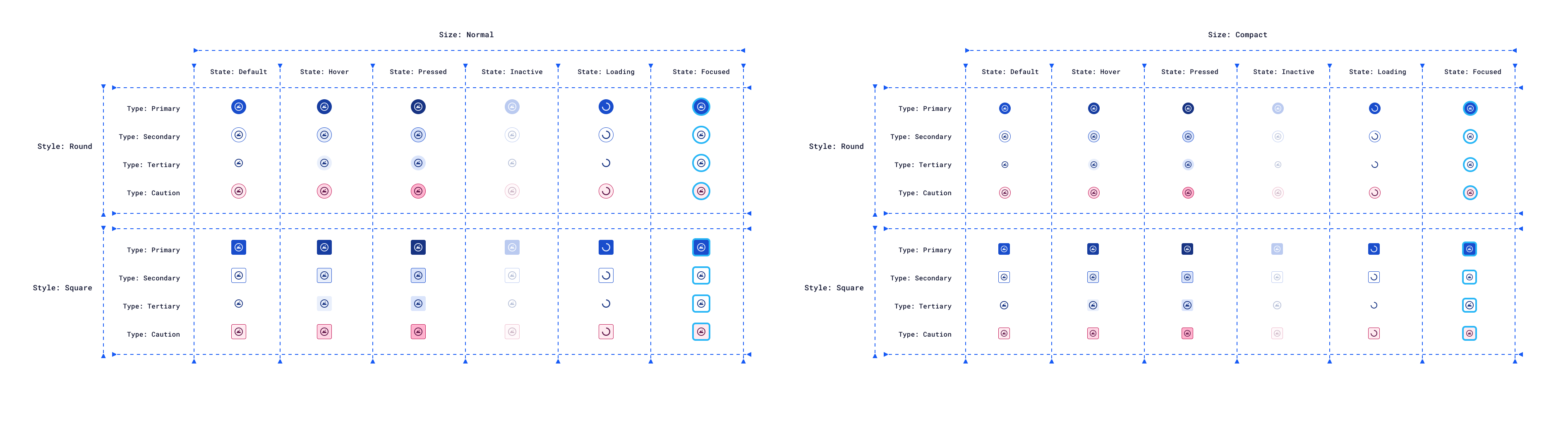
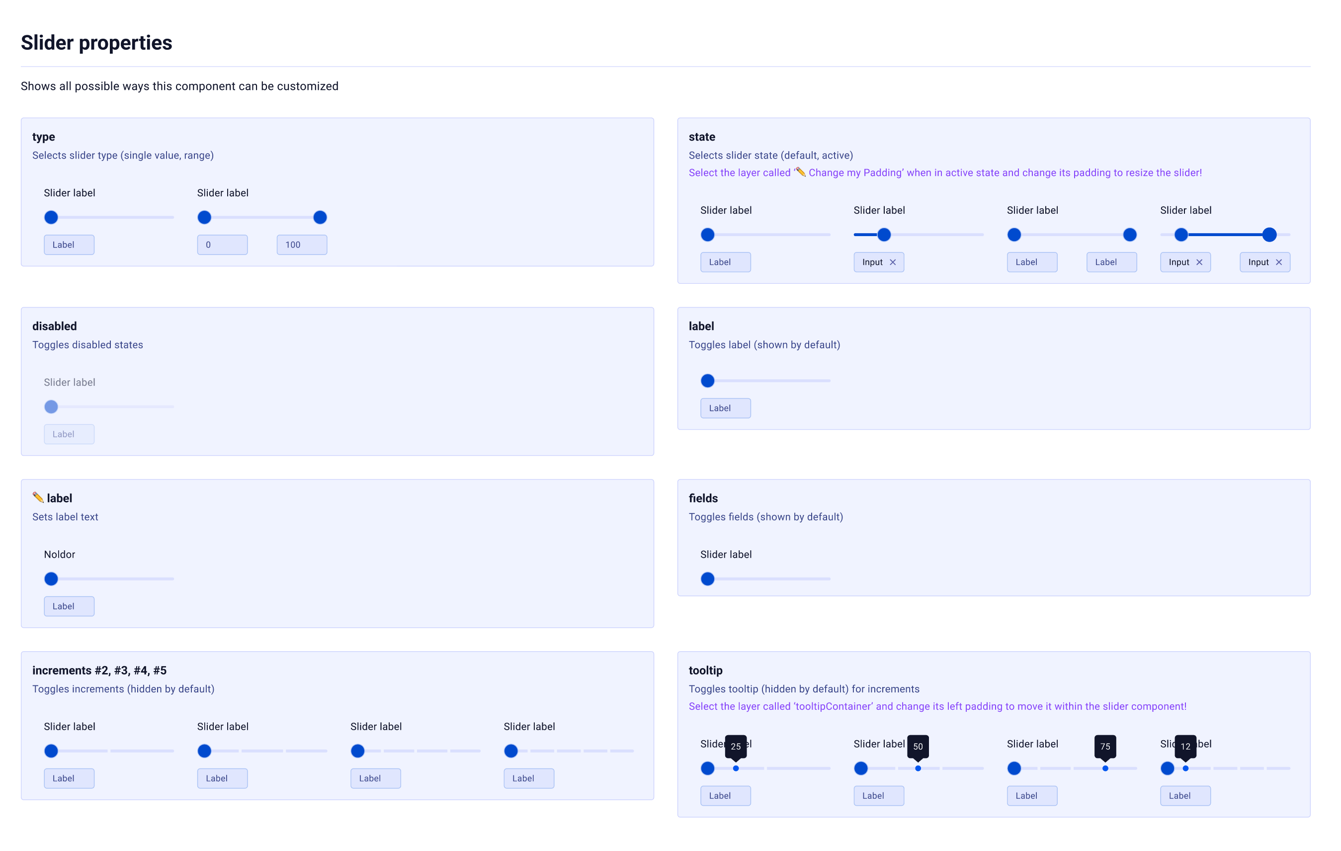
6 types Status signals for data-dense interfaces#5E8DF8→#175BF5#1EBE96→#107962#F5A300→#D67D00#FF4D8D→#D4165F#BD8FFF→#A566FF#B6B8CD→#52567AComponents & Organisms
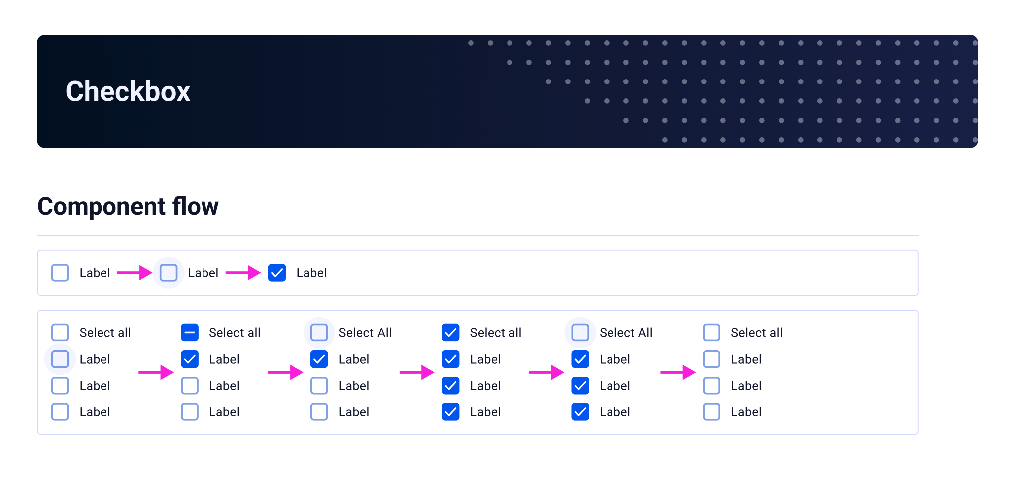
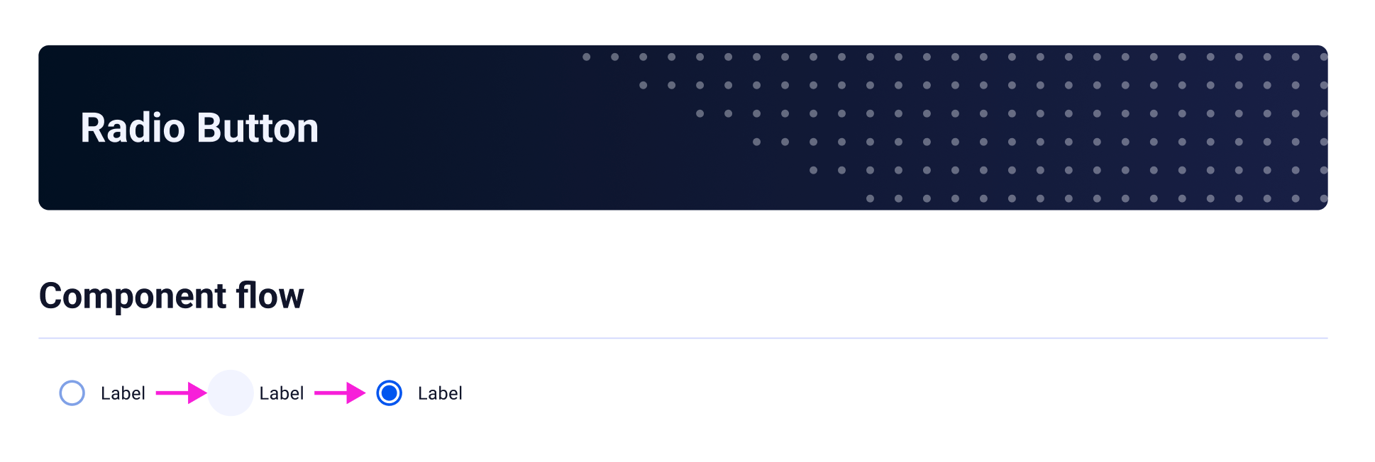
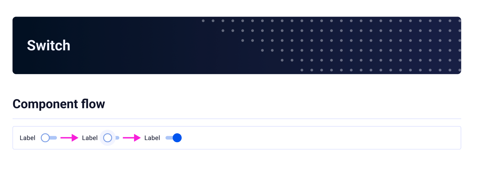
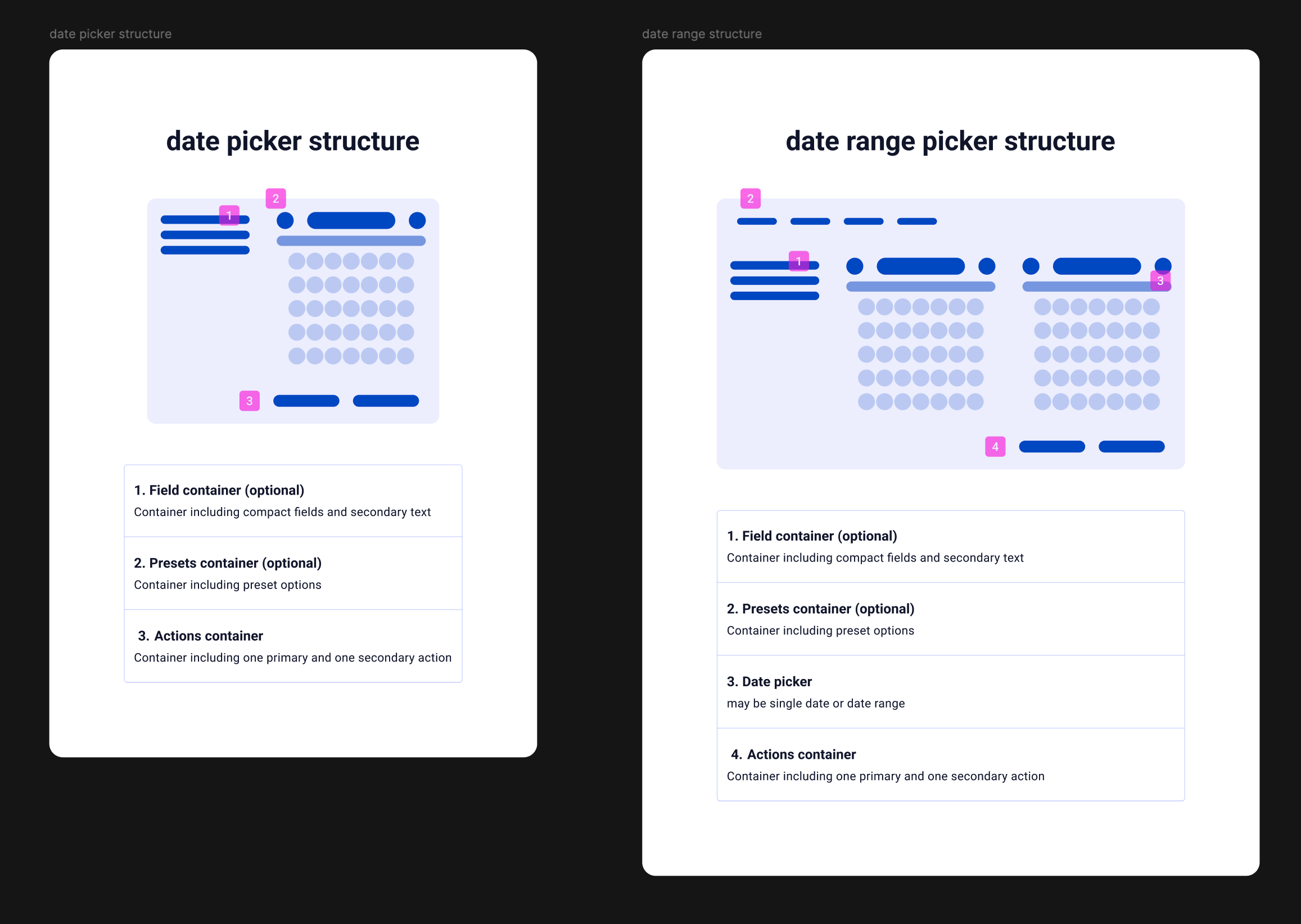
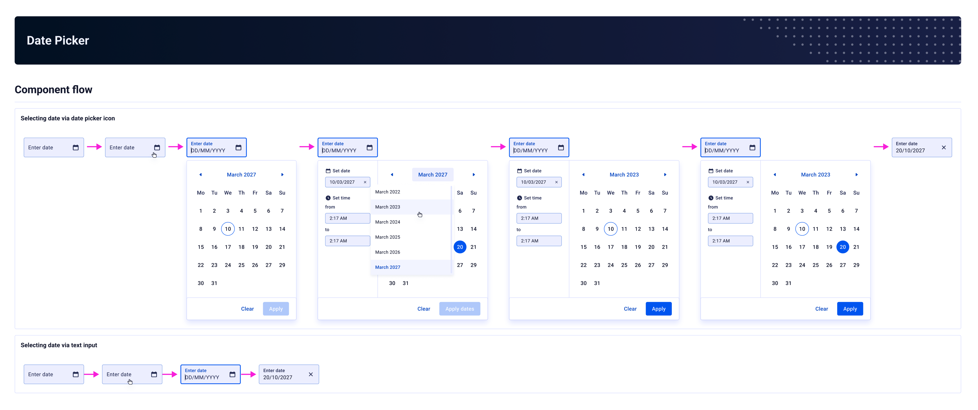
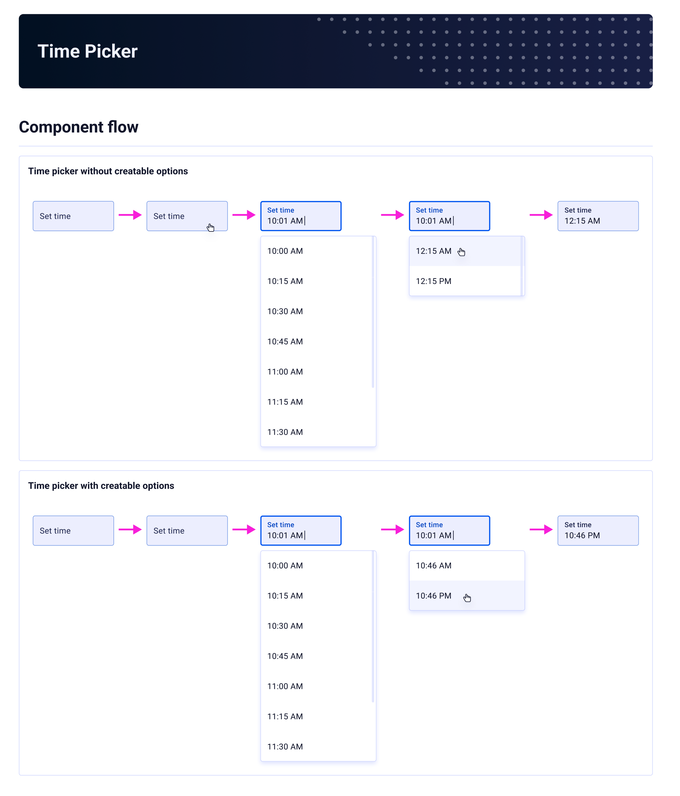
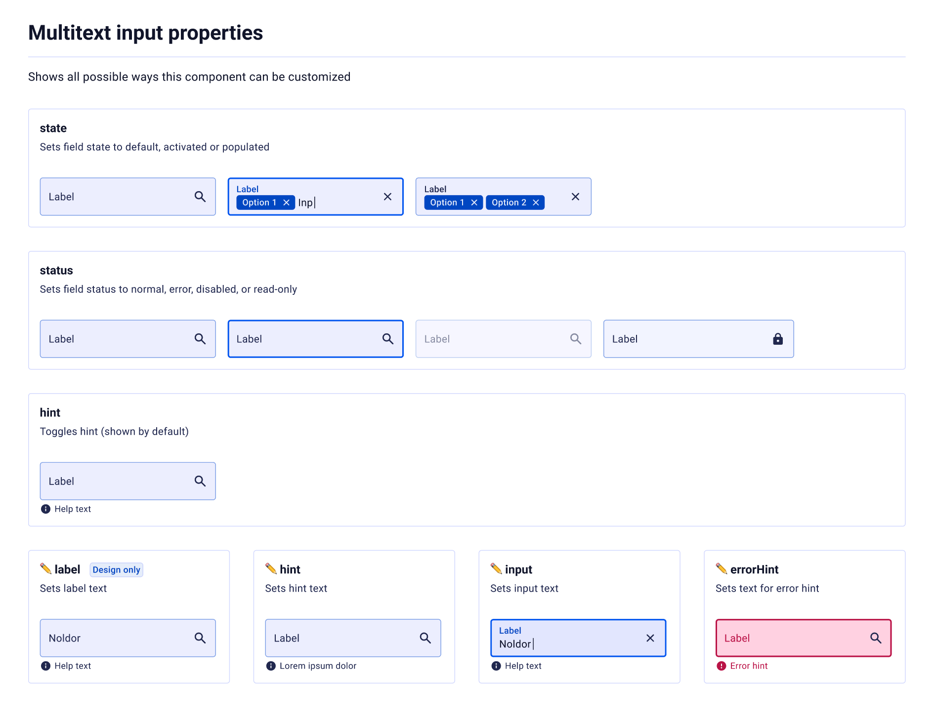
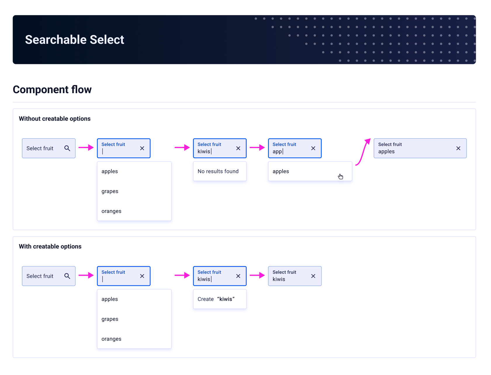
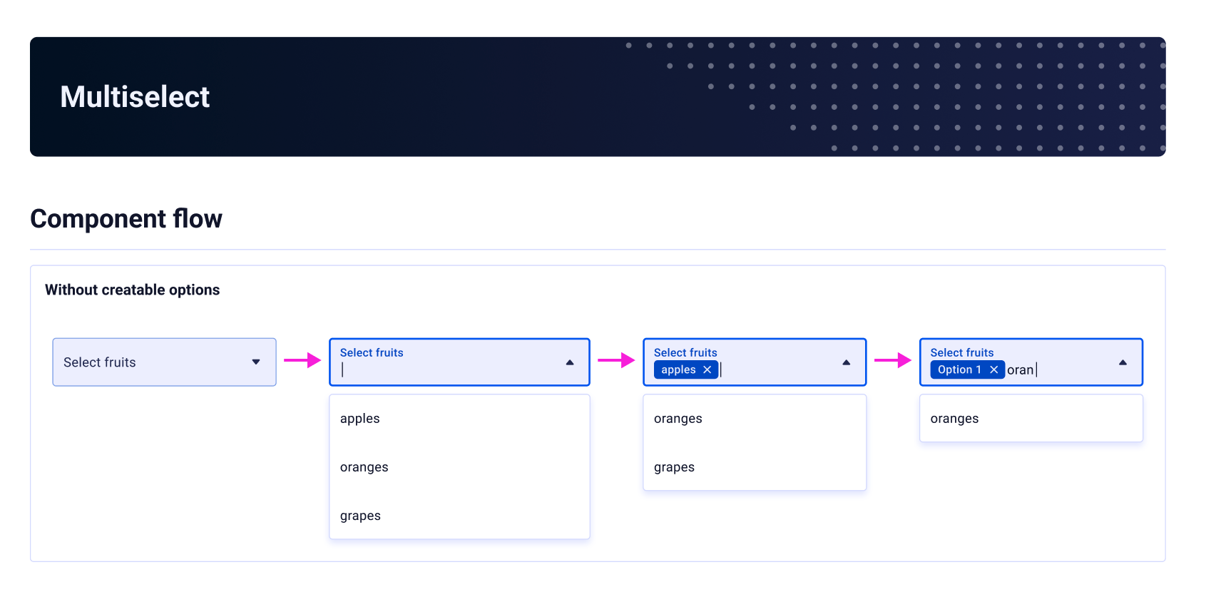
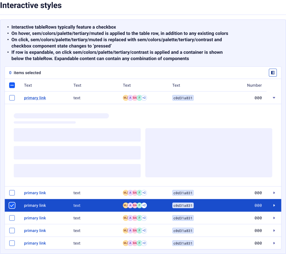
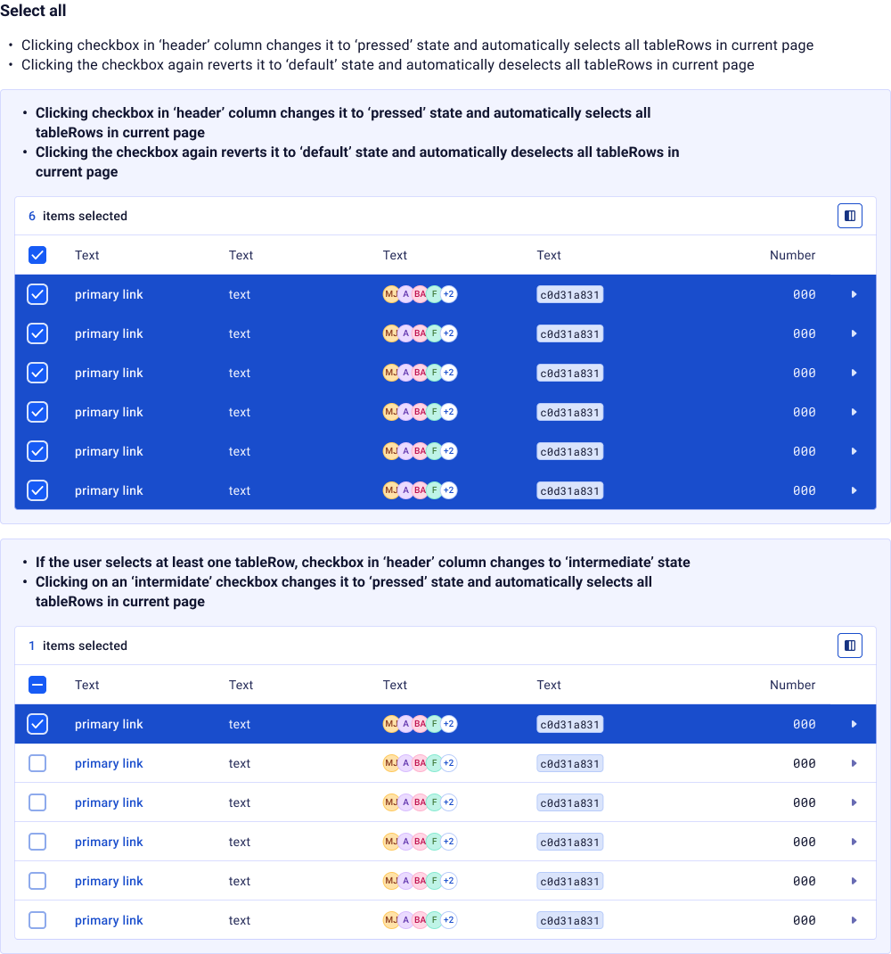
A selection of the components we designed and developed for Ictinus. Click a category to explore.
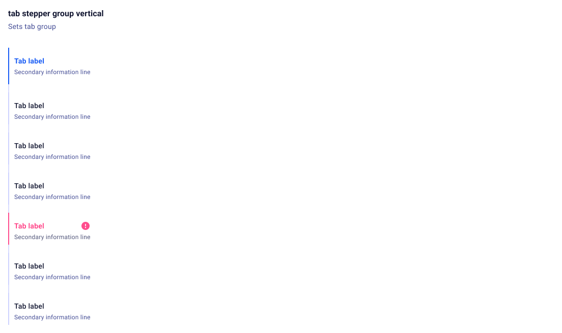
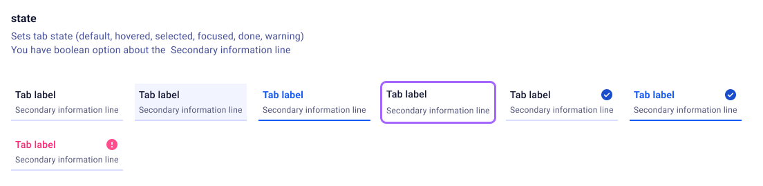
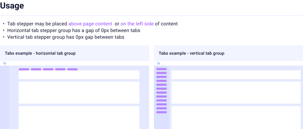
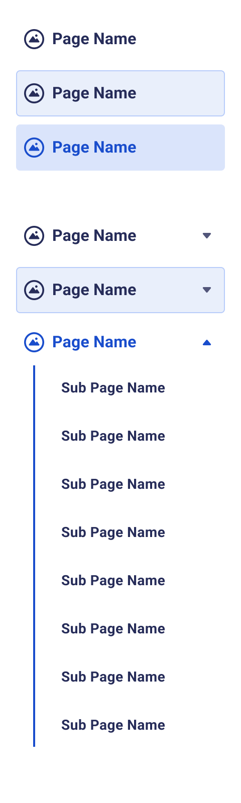
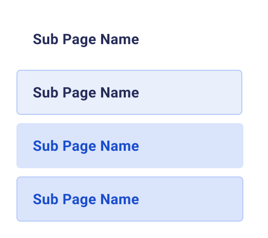
Navigation
7 componentsInputs
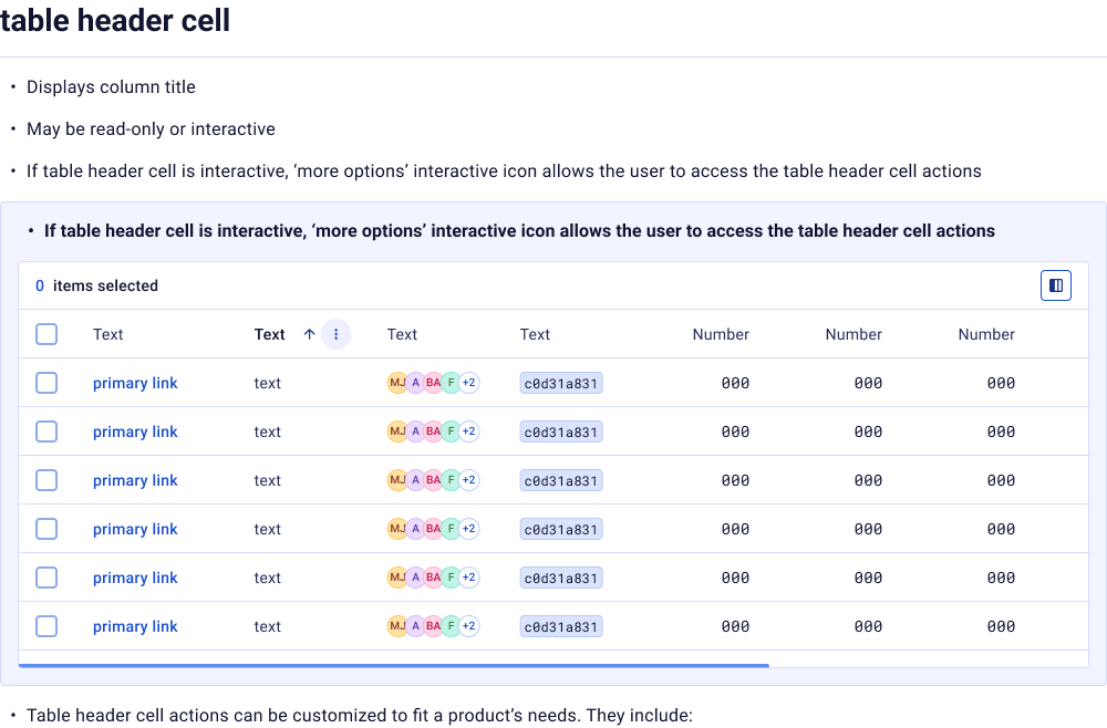
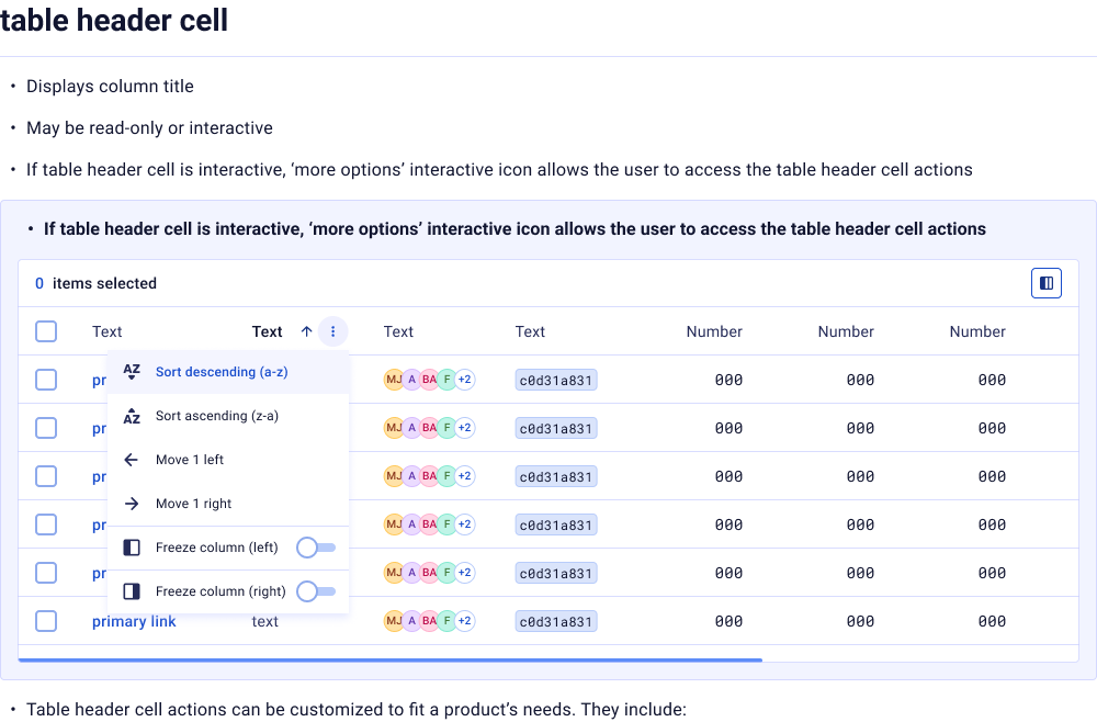
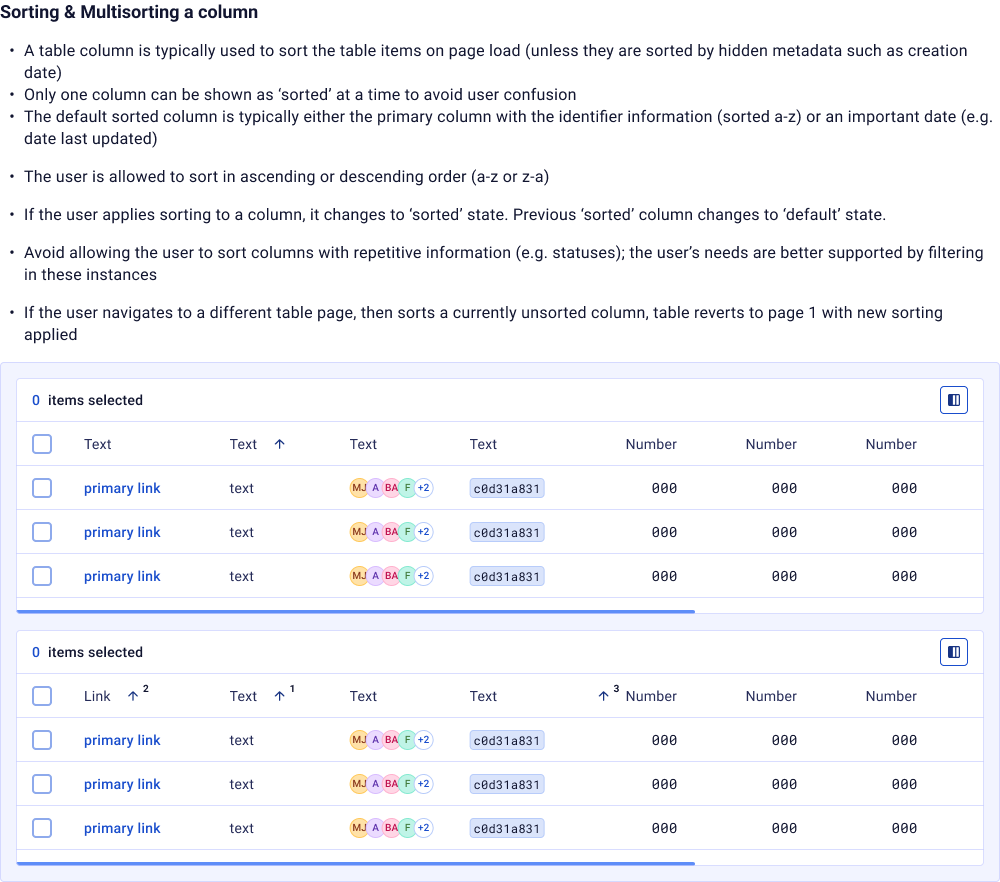
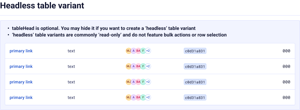
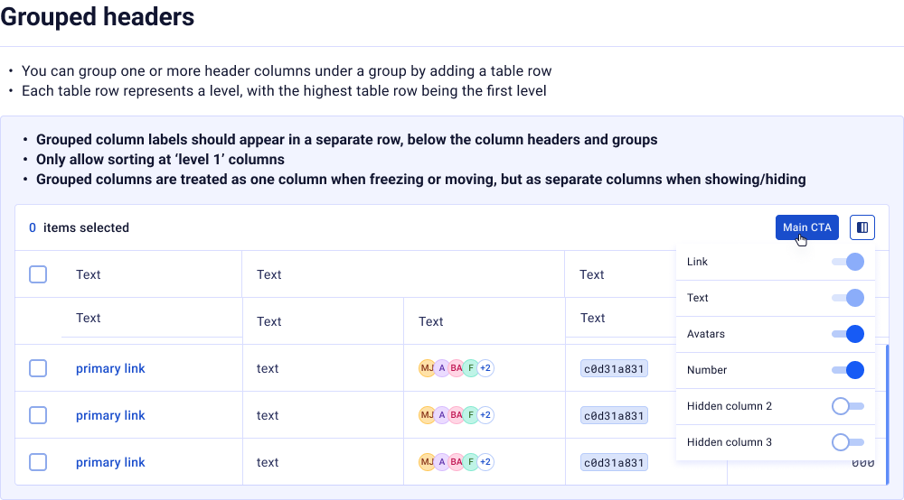
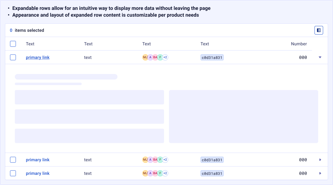
10 componentsDatagrid
1 componentNavigation


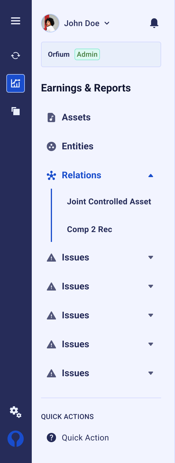
Inputs

Datagrid

Patterns
Reusable interaction patterns that combine multiple components to solve common UX challenges across products.
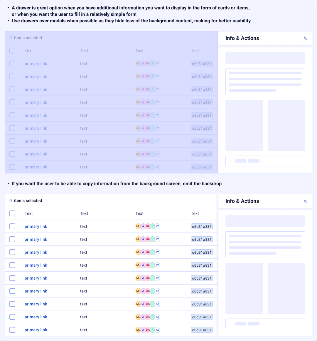
Sidesheet
A surface anchored to the viewport edge for secondary tasks like forms, help panels, and multi-step wizards.
Modal
An overlay dialog for focused interactions — confirmations, danger actions, custom forms, and informational content.
Asset Matching
Side-by-side comparison workflow for matching music assets — linking recordings to compositions, resolving conflicts, and confirming metadata.
Design Principles
The governance model, conventions, and strategies that keep the system coherent, accessible, and scalable across teams.
Token Naming Convention
A strict {tier}/{category}/{property}/{variant} naming schema. Semantic tokens use sem/, component tokens use comp/. Slashes create natural groupings in Figma's variable panel.
Theming Strategy
Light and Dark modes are achieved purely through semantic token swapping; global raw values never change. Adding a new theme requires zero component modifications.
Alias Architecture
Every component token aliases a global primitive, never a raw value. This creates a traceable chain: comp/button/normal/size → sizing/9 → 36px. One change cascades everywhere.
Documentation Standard
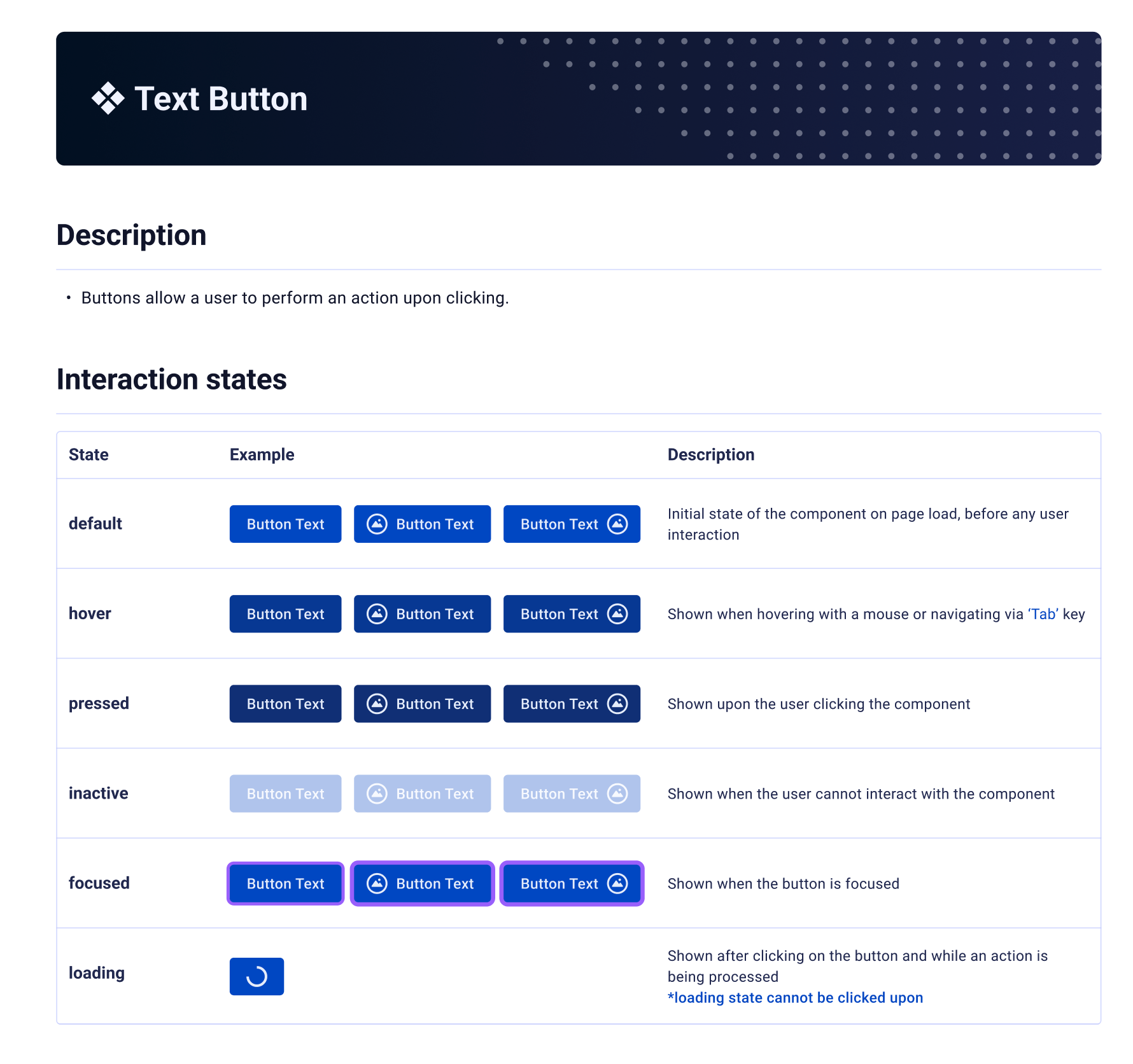
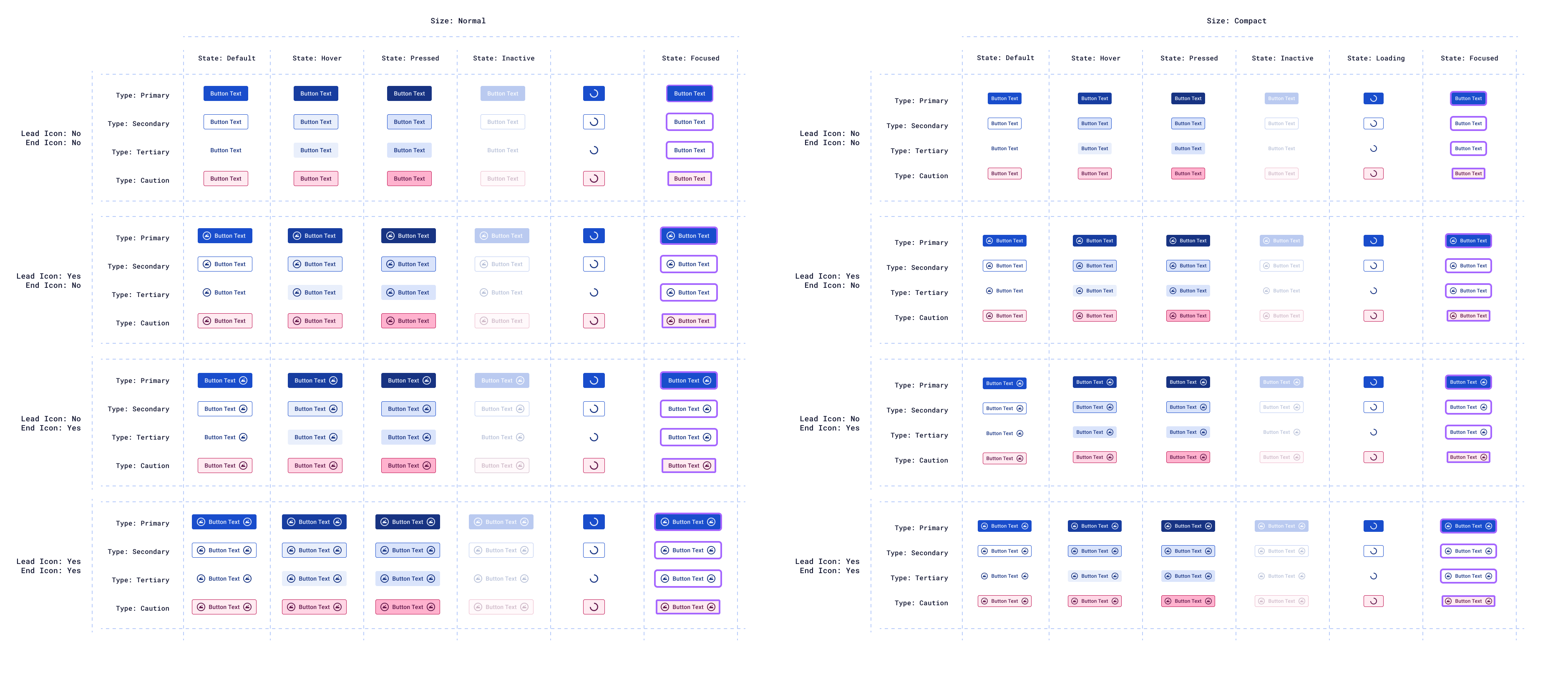
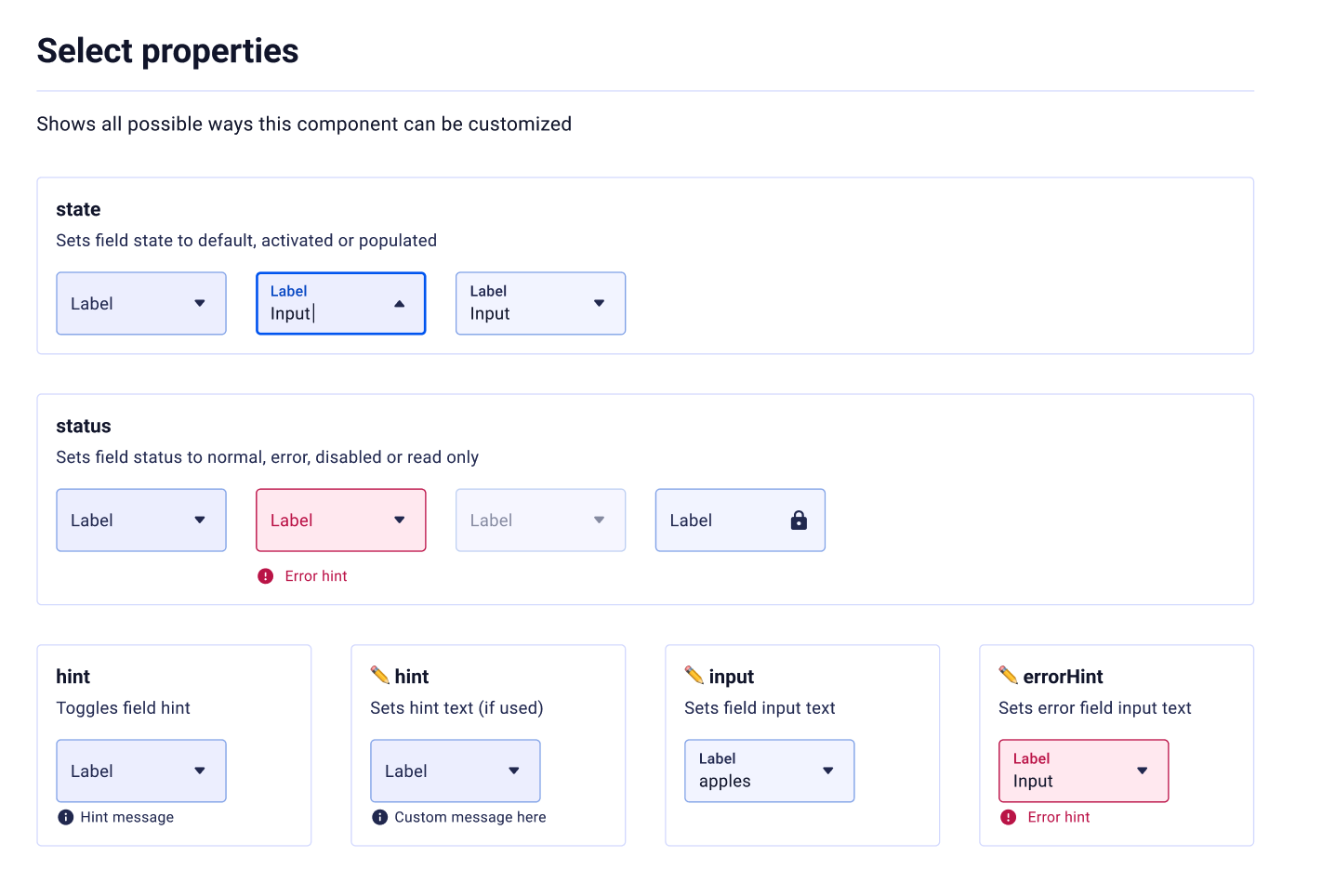
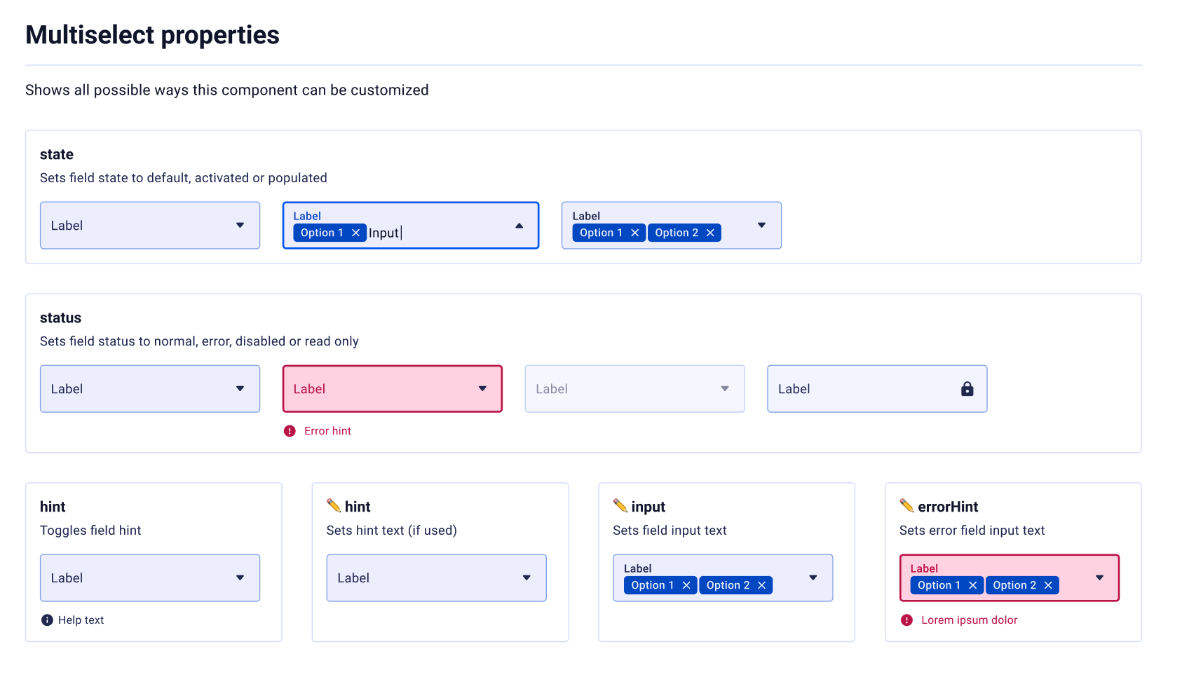
Each component page follows a fixed structure: Token table, Anatomy, Description, When to use / When not to use, Properties reference, and Interactive examples.
Scale Progression
Sizing and spacing use a non-linear 4px-base progression. Values densify at small increments (4, 8, 12, 16) for micro spacing, then expand at larger values (72, 80, 100, 140) for macro layout.
Governance & Review
New tokens require justification. Component tokens must alias globals; hardcoded values are flagged during reviews. A quarterly audit ensures token hygiene and consolidates duplicates.
Accessibility First
Every color combination is validated against WCAG 2.1 AA (4.5:1 for text, 3:1 for large text). Focus states use a dedicated token (borderColor/interactive/focused) visible in both themes.
Adoption & Migration
Adoption is driven through enablement. A Storybook instance provides a living reference. Lint rules flag hardcoded values. Training sessions ensure questions are resolved within hours.
Reflection
Building Ictinus taught me that a design system's true power lies not in its components, but in its token architecture. The 4-tier system (Global, Dimension, Semantic, Component) creates a single source of truth that makes theming trivial and consistency automatic.
The most impactful decision was enforcing semantic aliases throughout. When every component references tokens by meaning rather than value, you unlock the ability to reshape an entire product's visual identity by changing a handful of global primitives. That's the promise of design tokens, fully realized.
Version 5.1.1 represents years of iteration, pruning, and governance. The 291 tokens we have today aren't the result of addition; they're the result of relentless subtraction, ensuring every token earns its place in the system.