Koha
Designing a mobile experience that turns local shopping into community support.
Koha reimagines everyday commerce as an act of community generosity. Built for small American communities, the app creates a closed-loop ecosystem where local merchants, schools, and families are connected through the simple act of shopping locally.
Every purchase at a participating merchant earns points. Those points flow directly into school fundraisers and nonprofit initiatives, transforming routine transactions into collective impact. The name "Koha" itself reflects the spirit of the platform: a Māori word meaning a gift given without expectation of return.
The Disconnect
Small communities have always thrived on the interdependence between families, schools, and local shops. But the digital economy has created a gap: families don't know which stores support their schools, merchants can't reach their neighborhood audience effectively, and schools struggle to run fundraisers beyond bake sales and car washes.
Koha was designed to bridge this gap, creating a transparent, rewarding system that makes community support visible, measurable, and effortless.
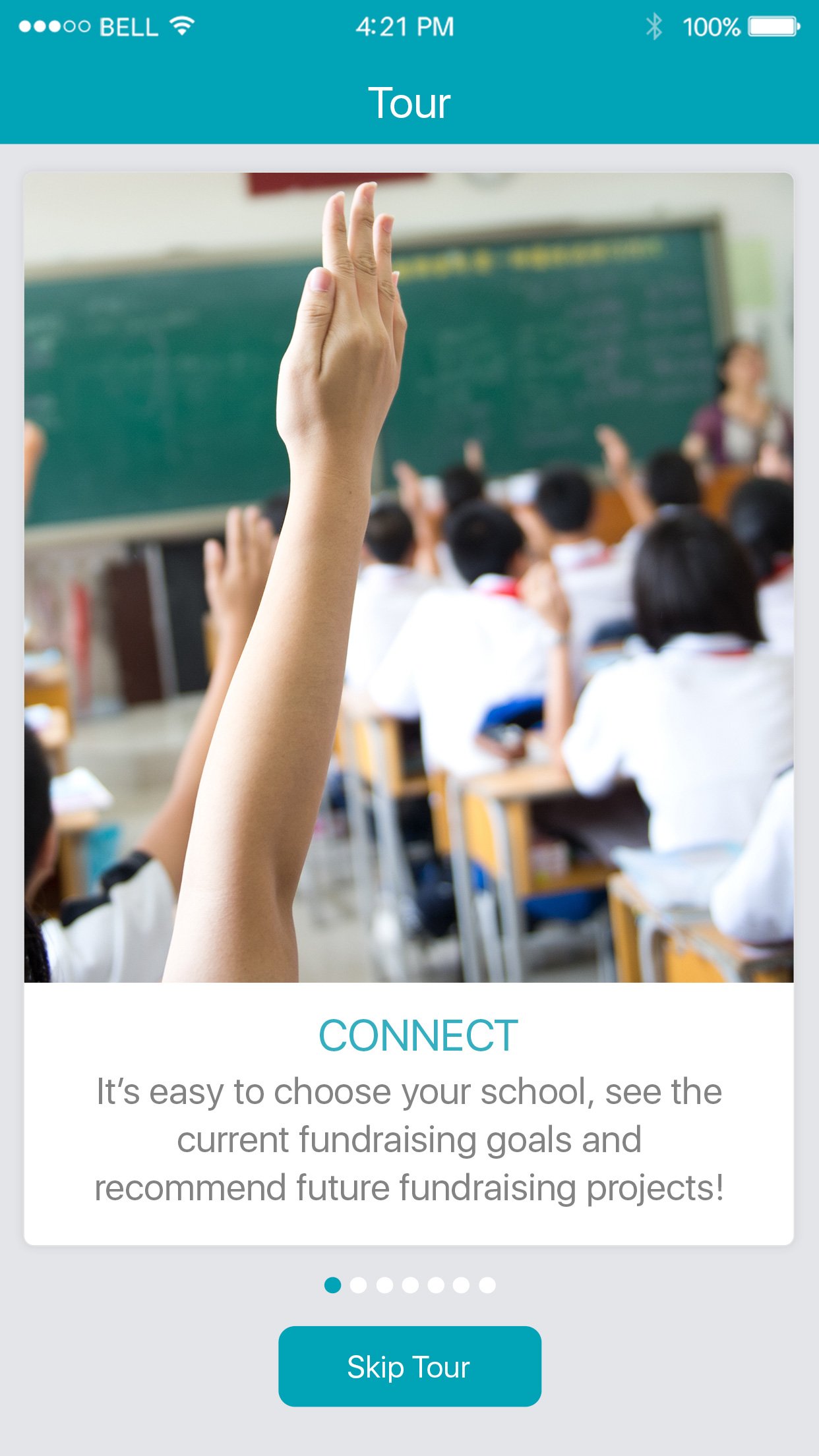
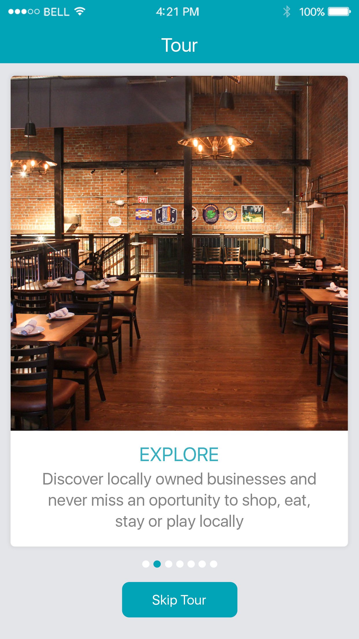
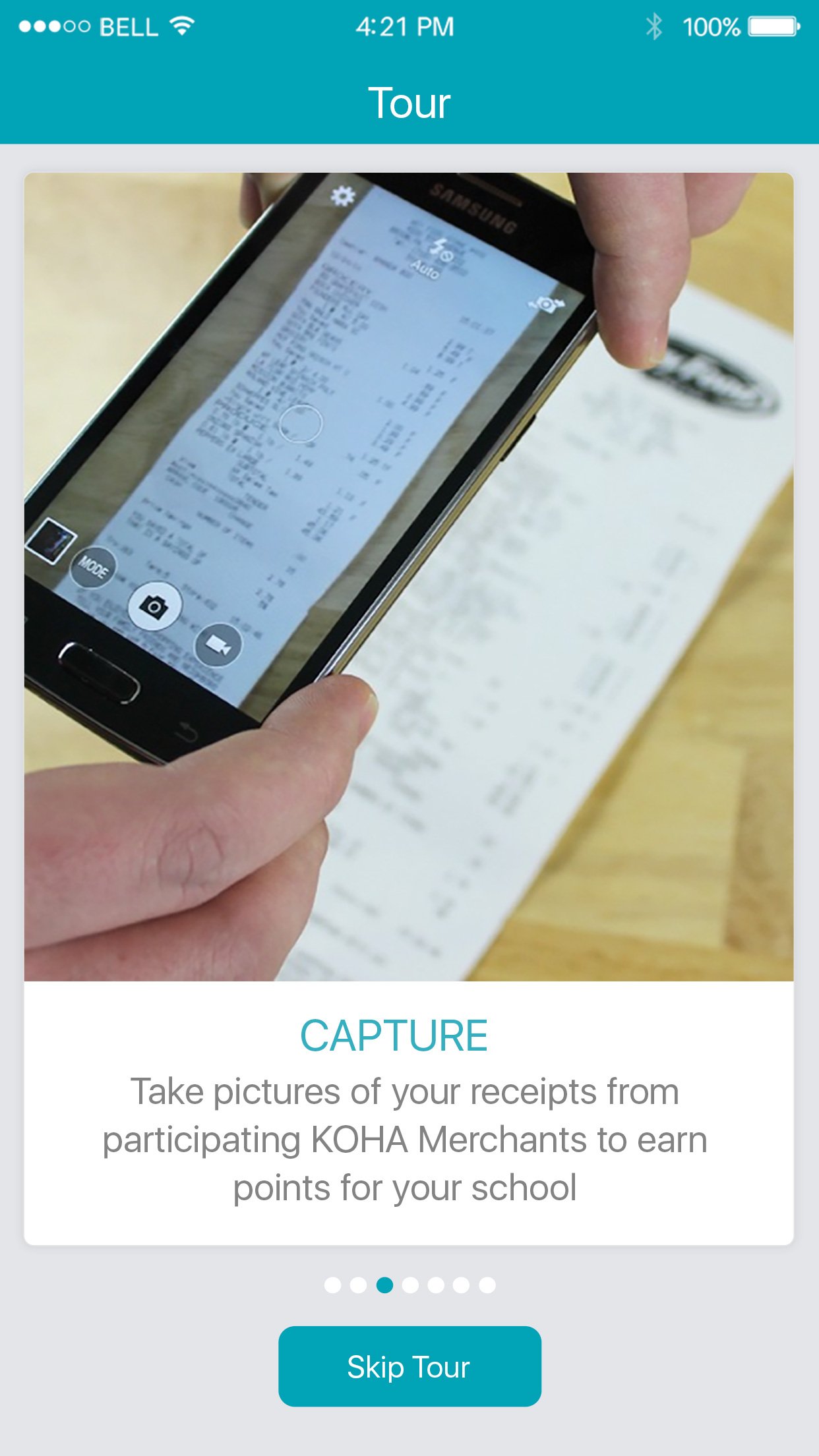
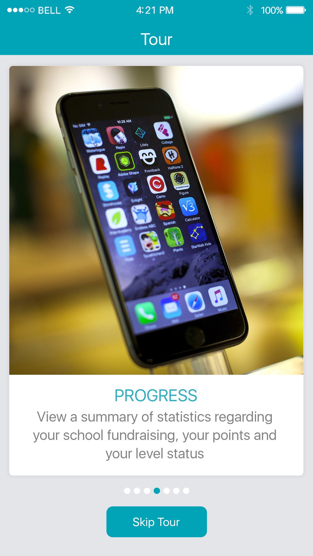
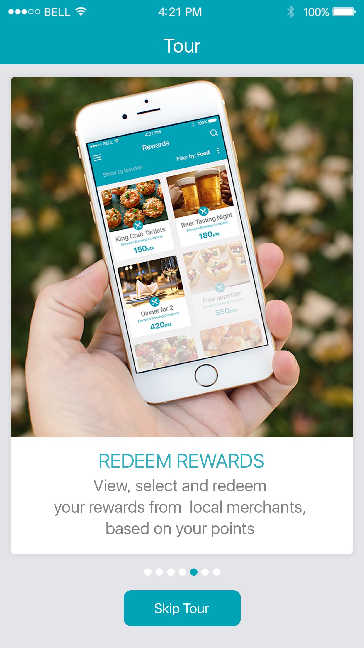
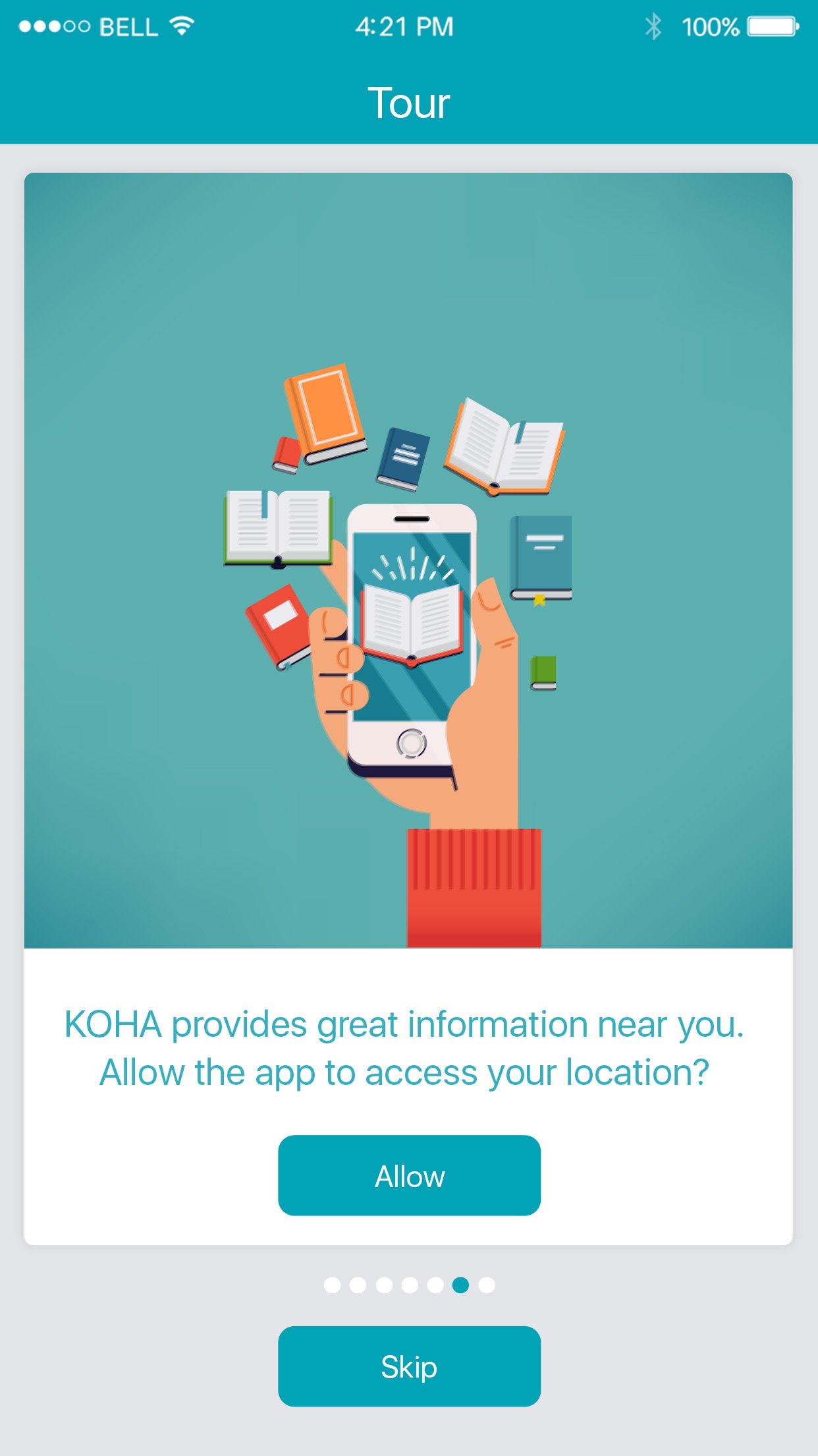
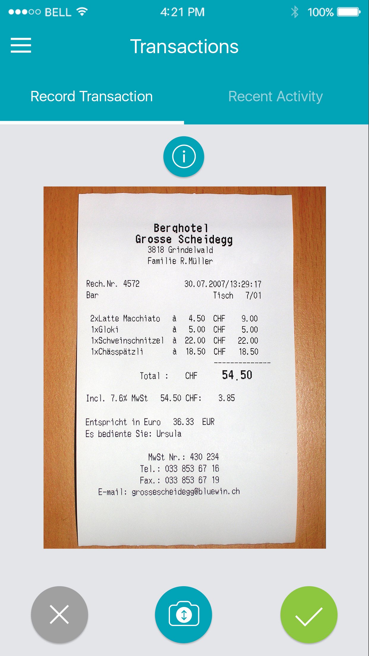
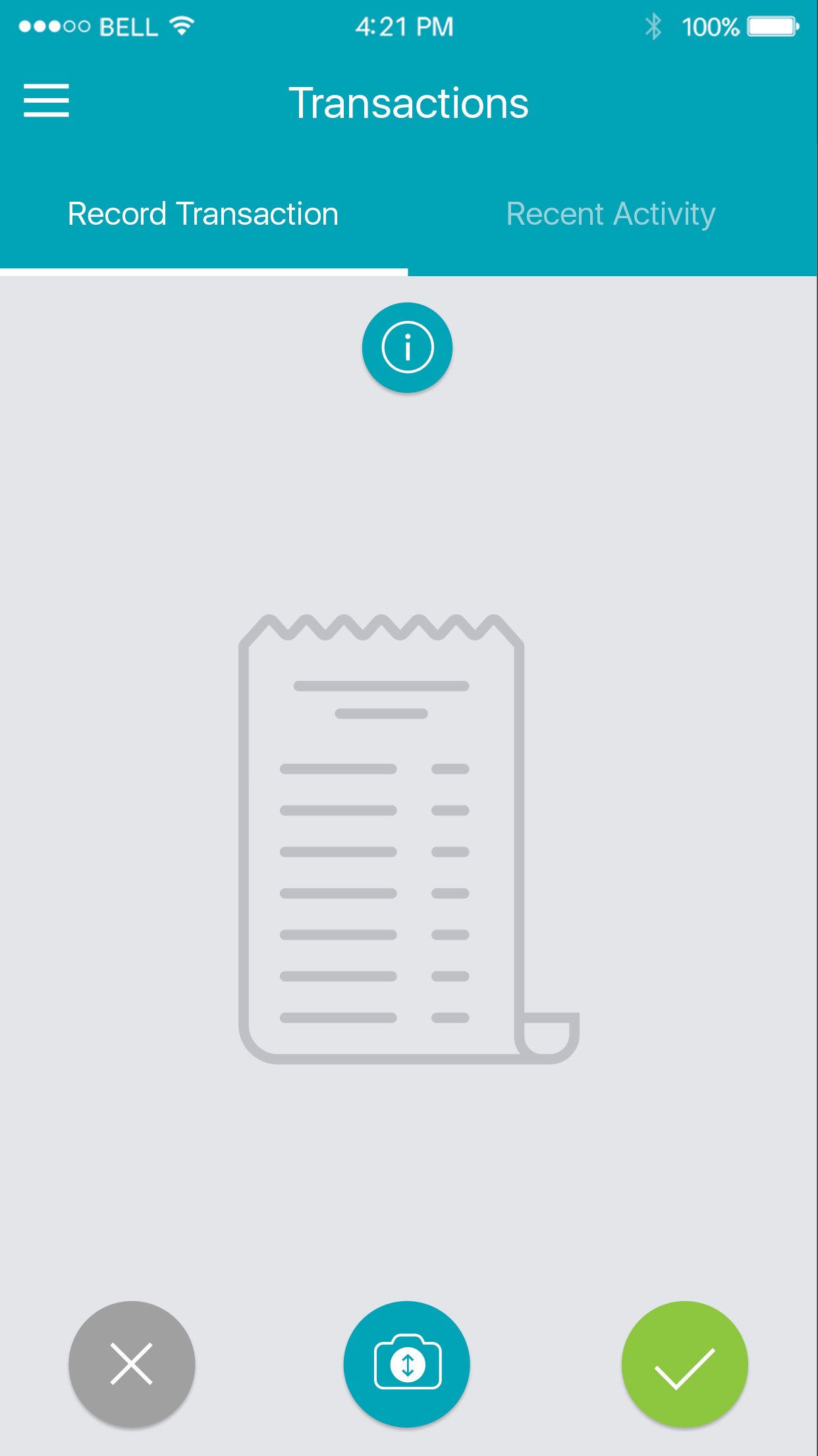
First Impressions
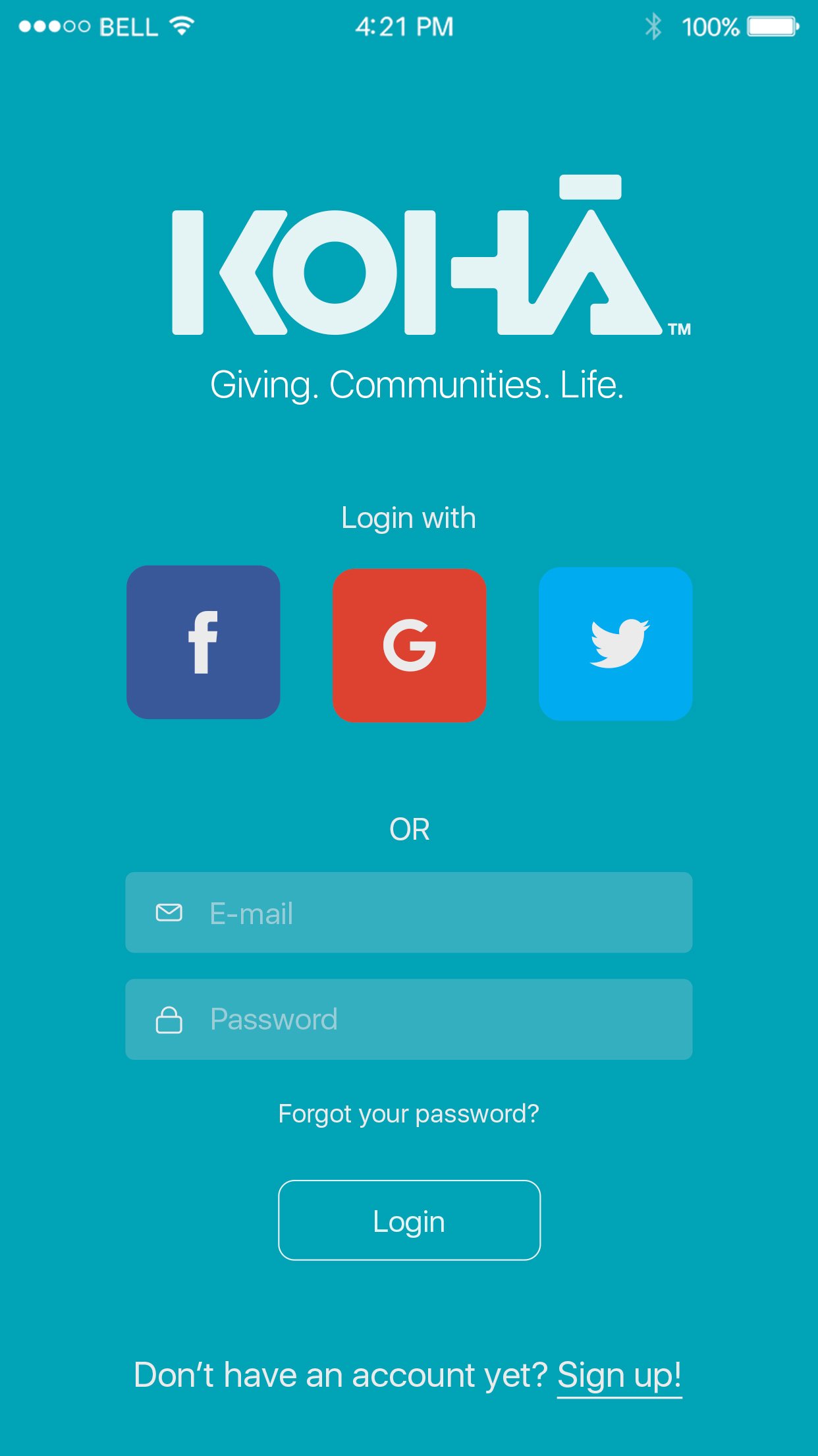
The onboarding experience introduces users to the core concept through a guided tour that explains the give-back loop in simple, visual steps. Each screen builds on the last, from discovering merchants to earning rewards to watching schools benefit.

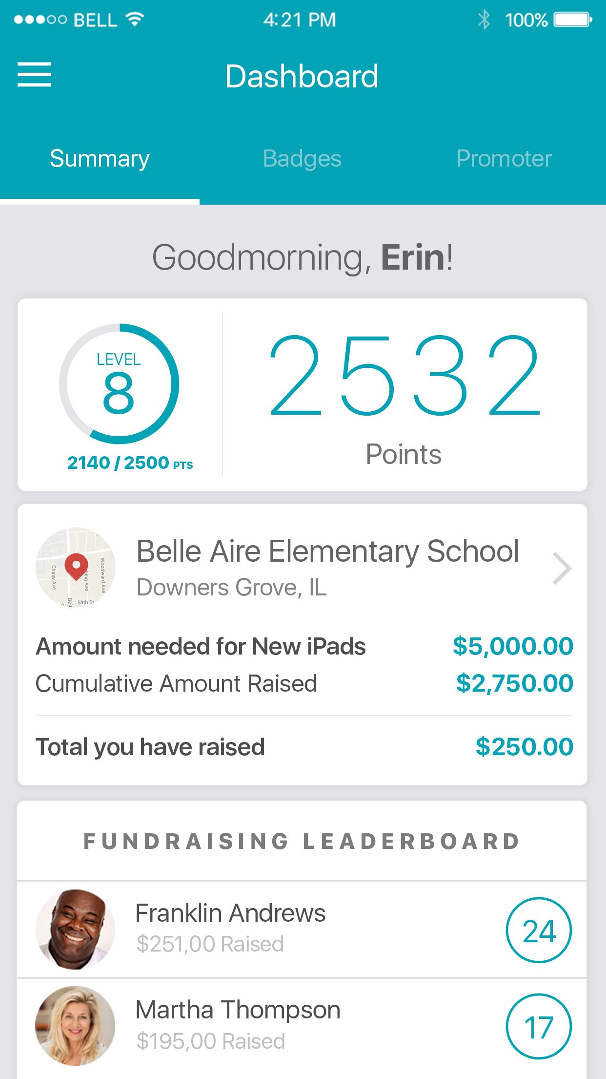
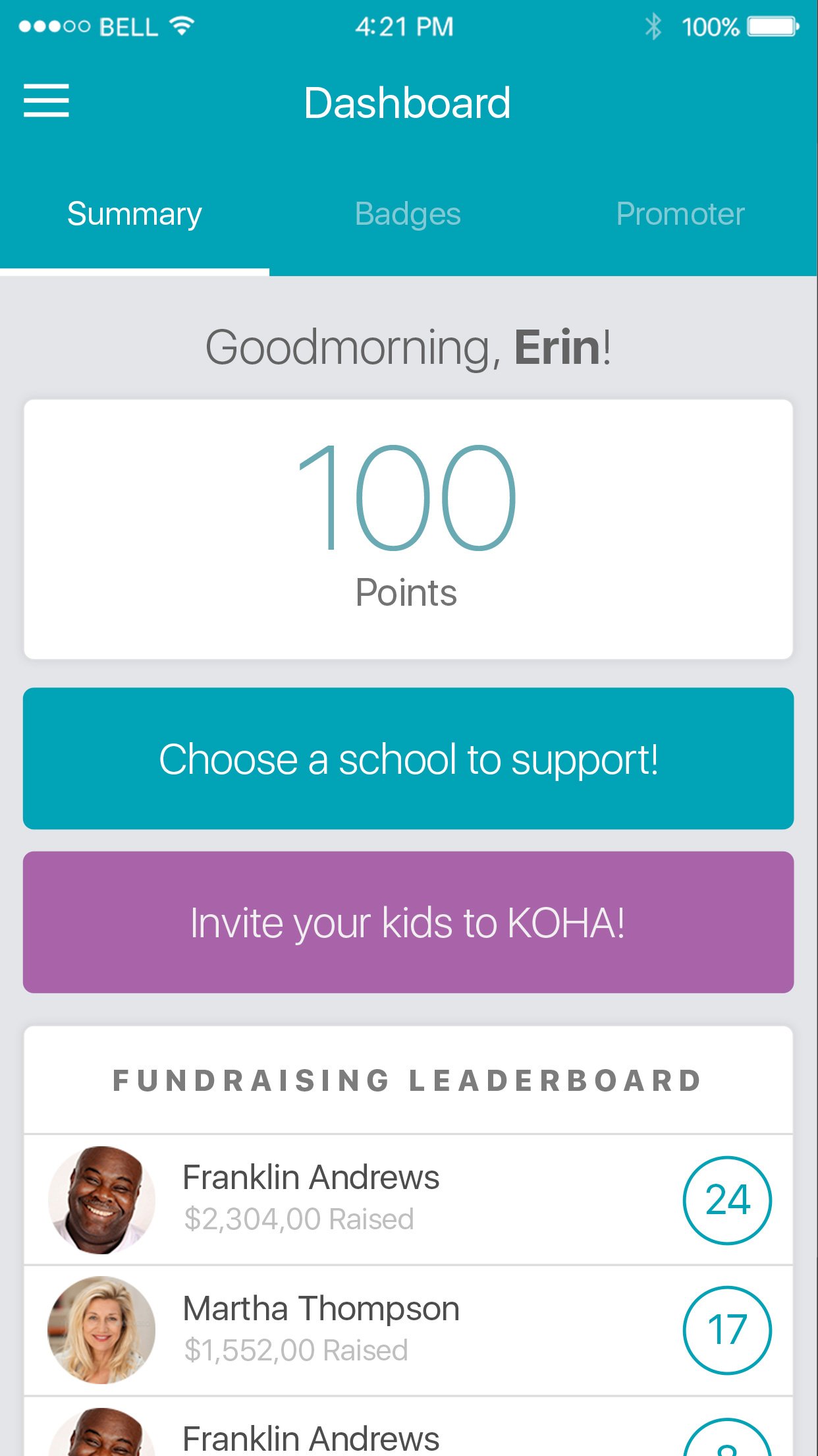
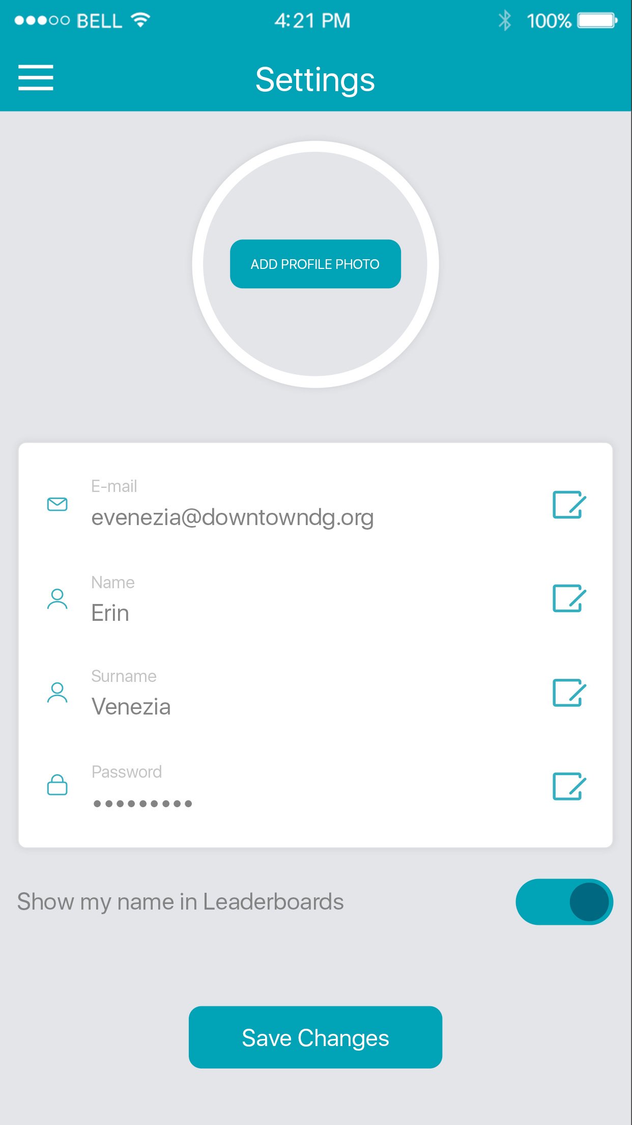
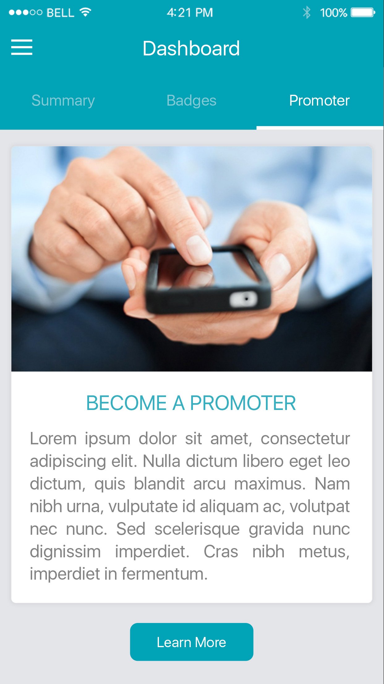
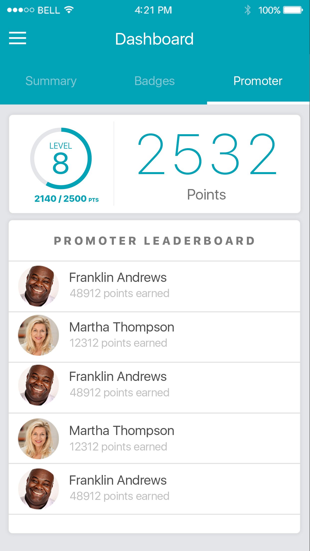
The Heart of the Experience
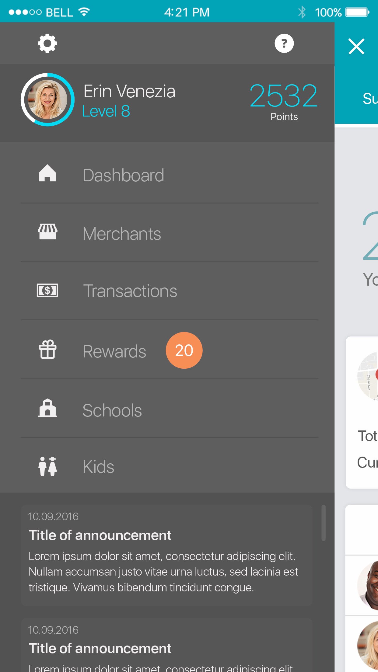
The dashboard is where impact becomes tangible. Users see their contribution level, earned badges, and a real-time summary of how their shopping habits are powering community fundraisers. A gamification layer, complete with levels and point milestones, keeps engagement high.
Progress bars, badge collections, and level-up celebrations turn passive users into active advocates for their community.


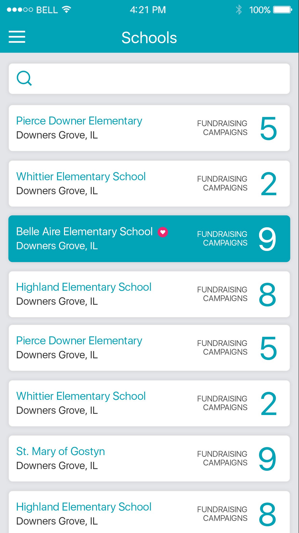
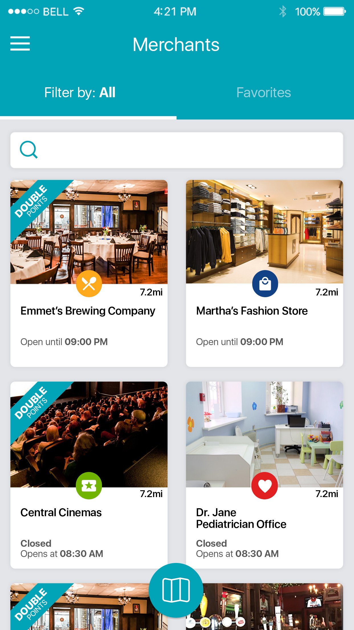

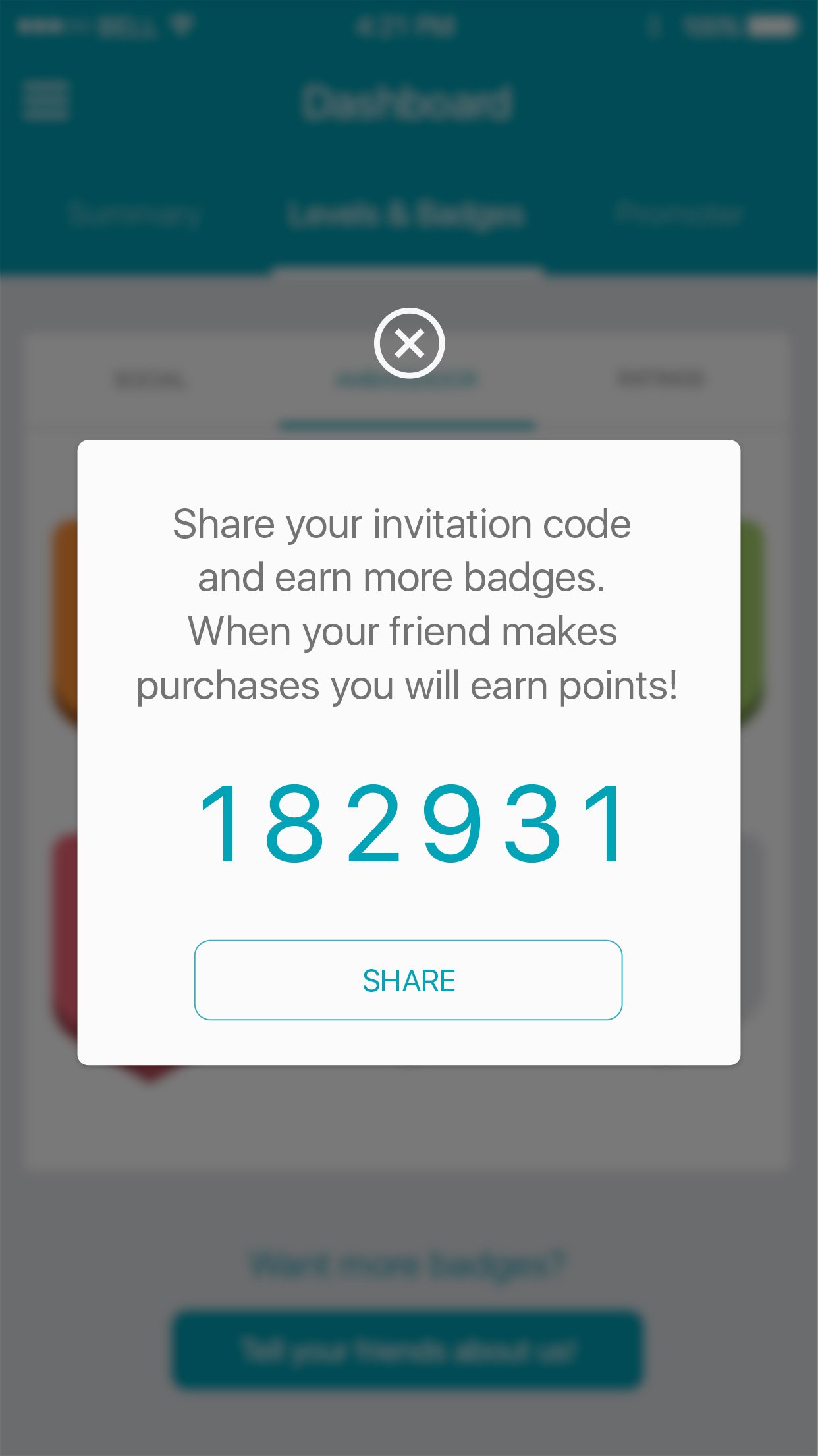
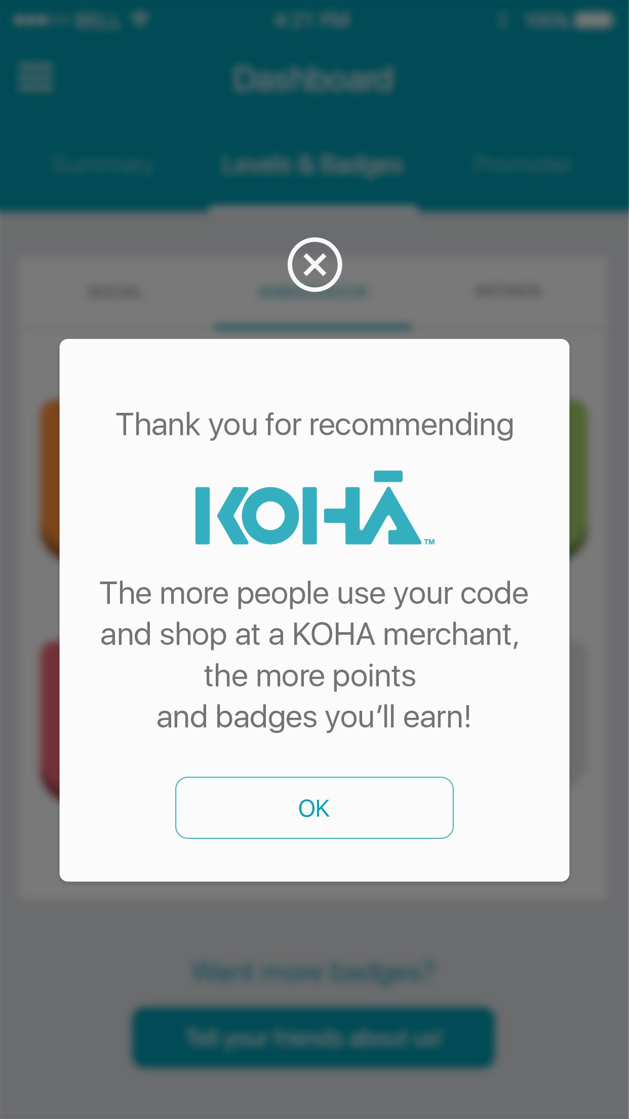
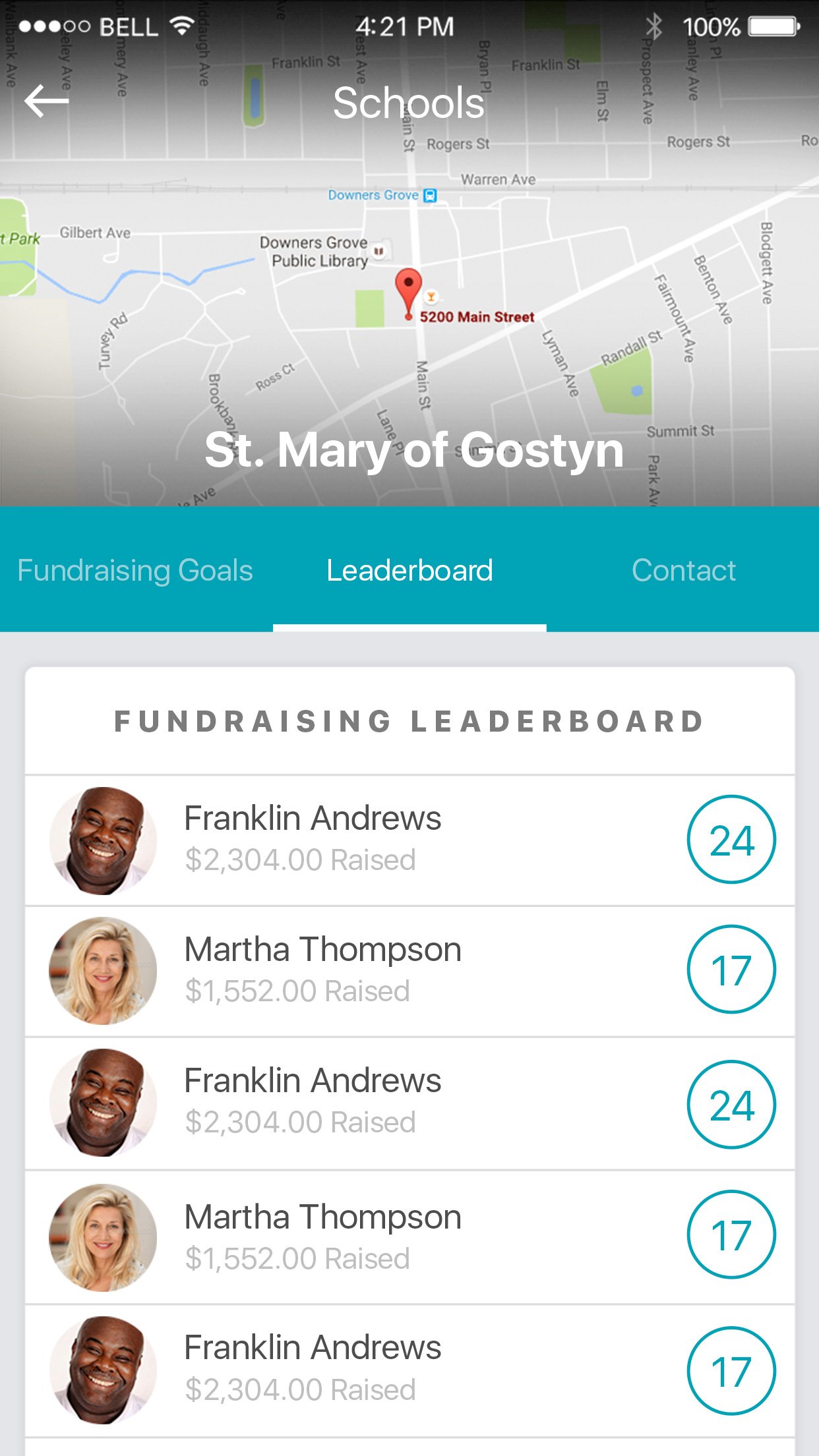
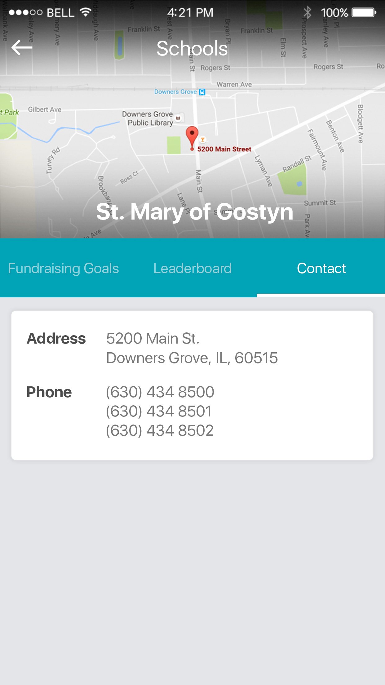
Connecting the Community
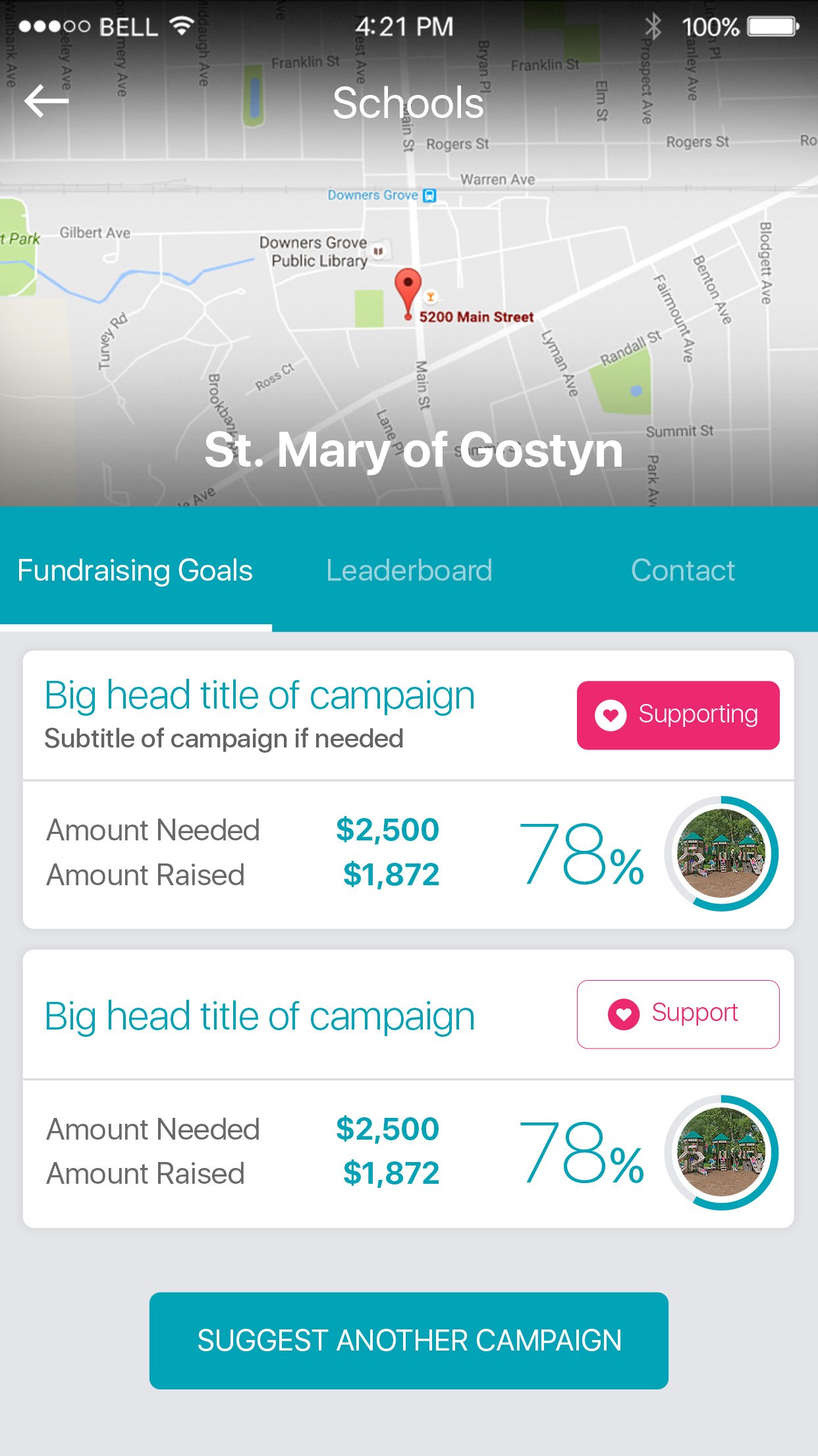
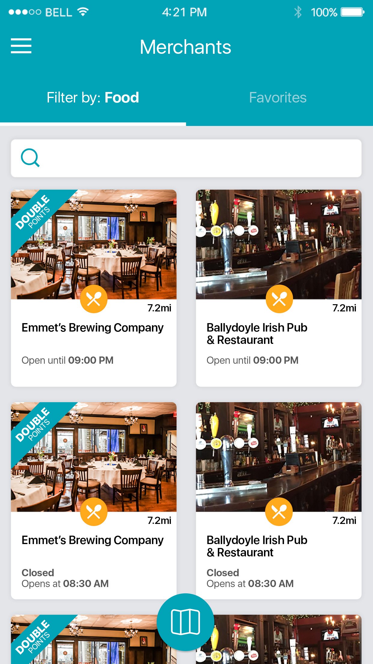
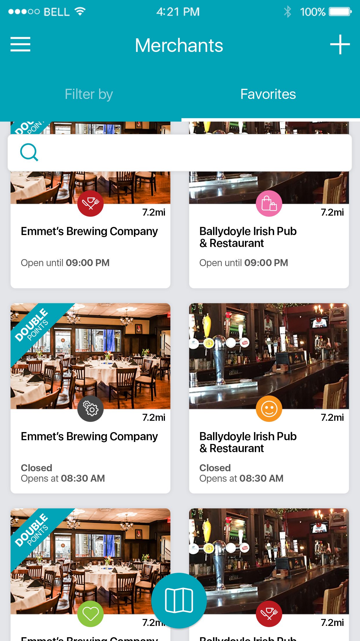
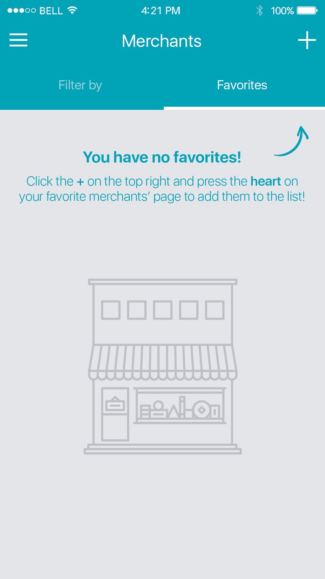
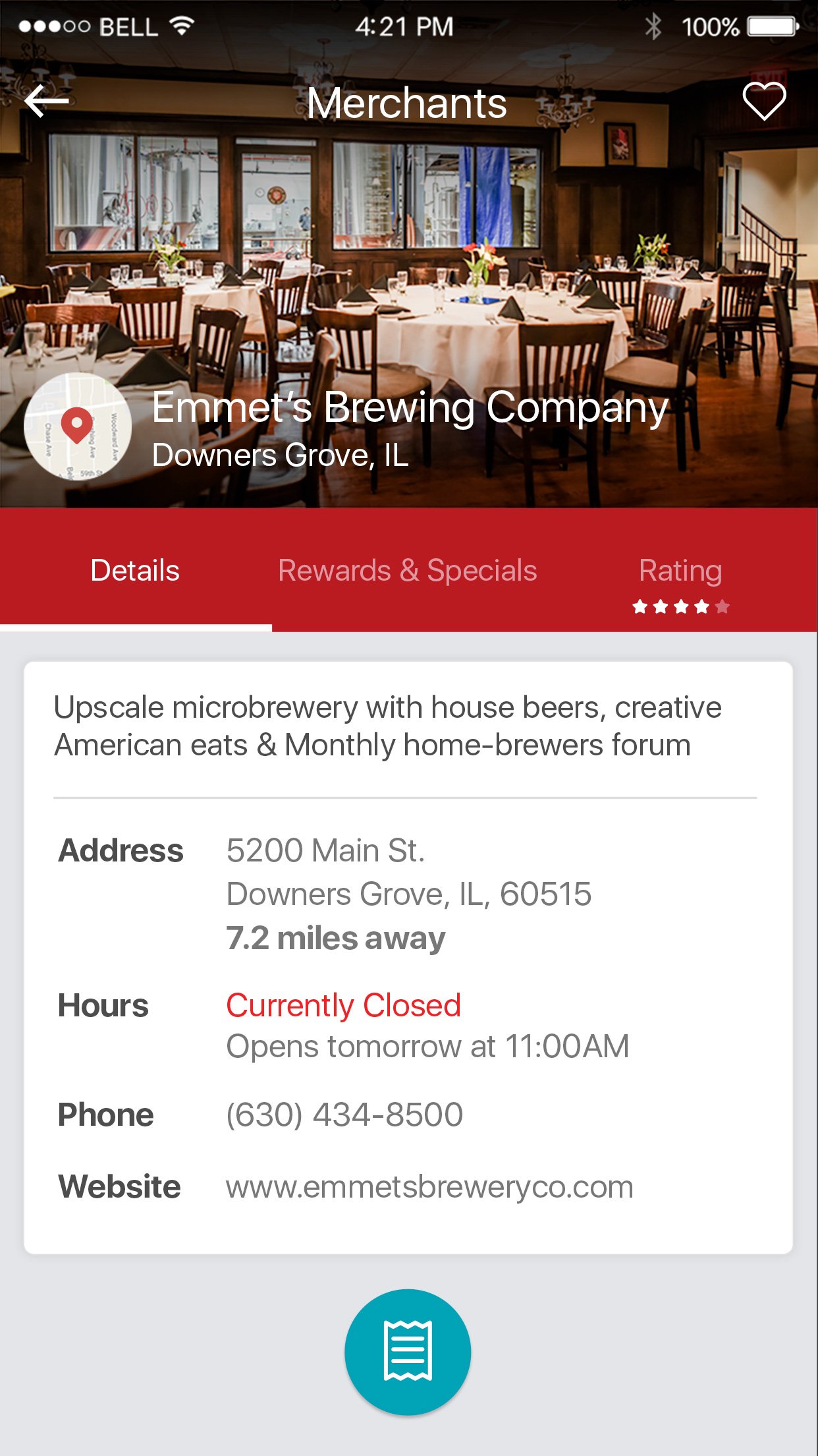
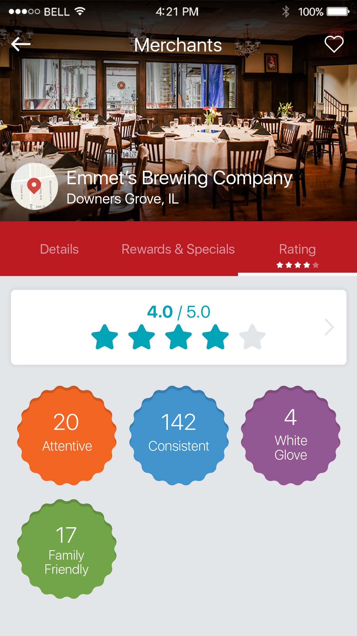
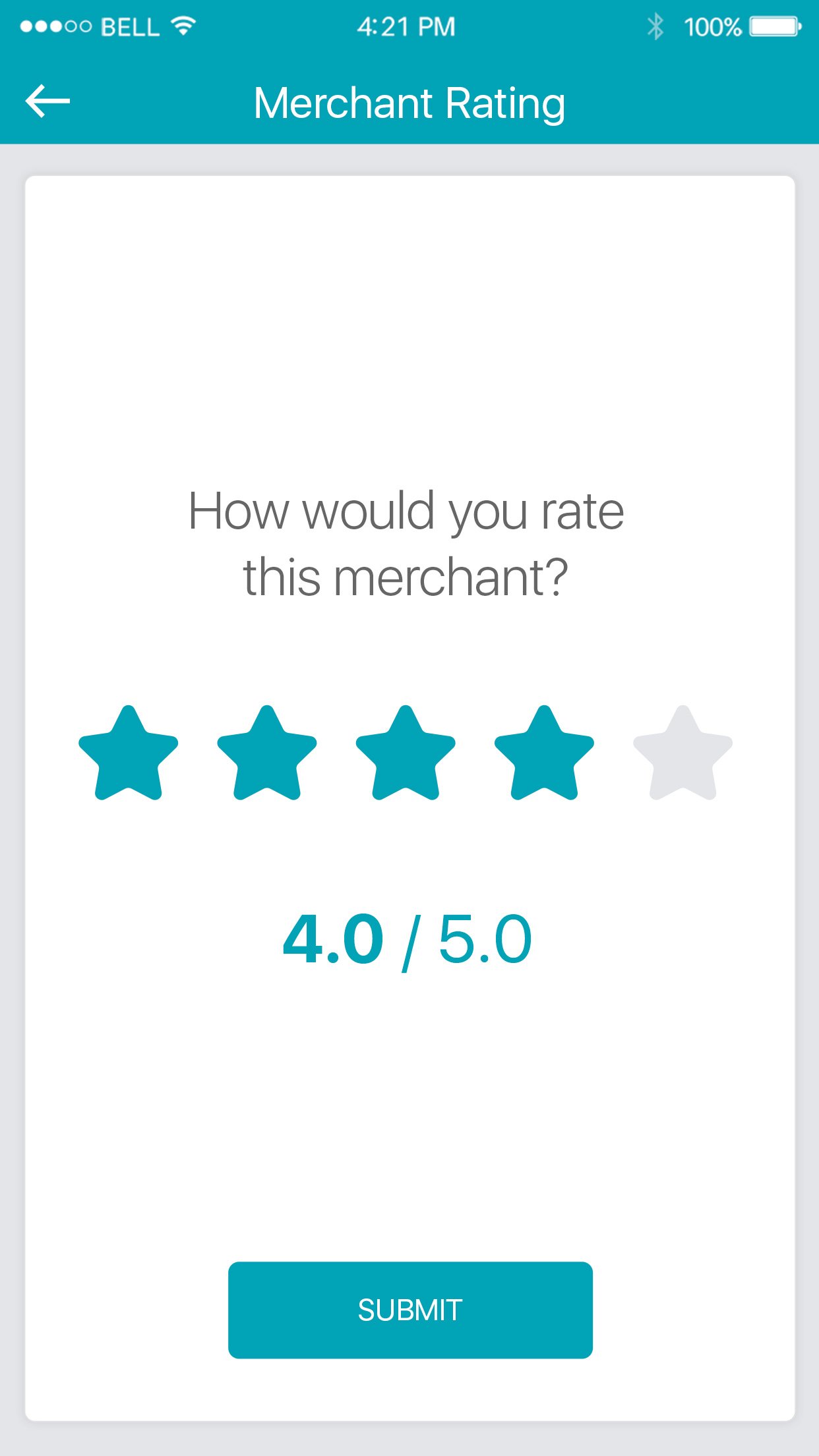
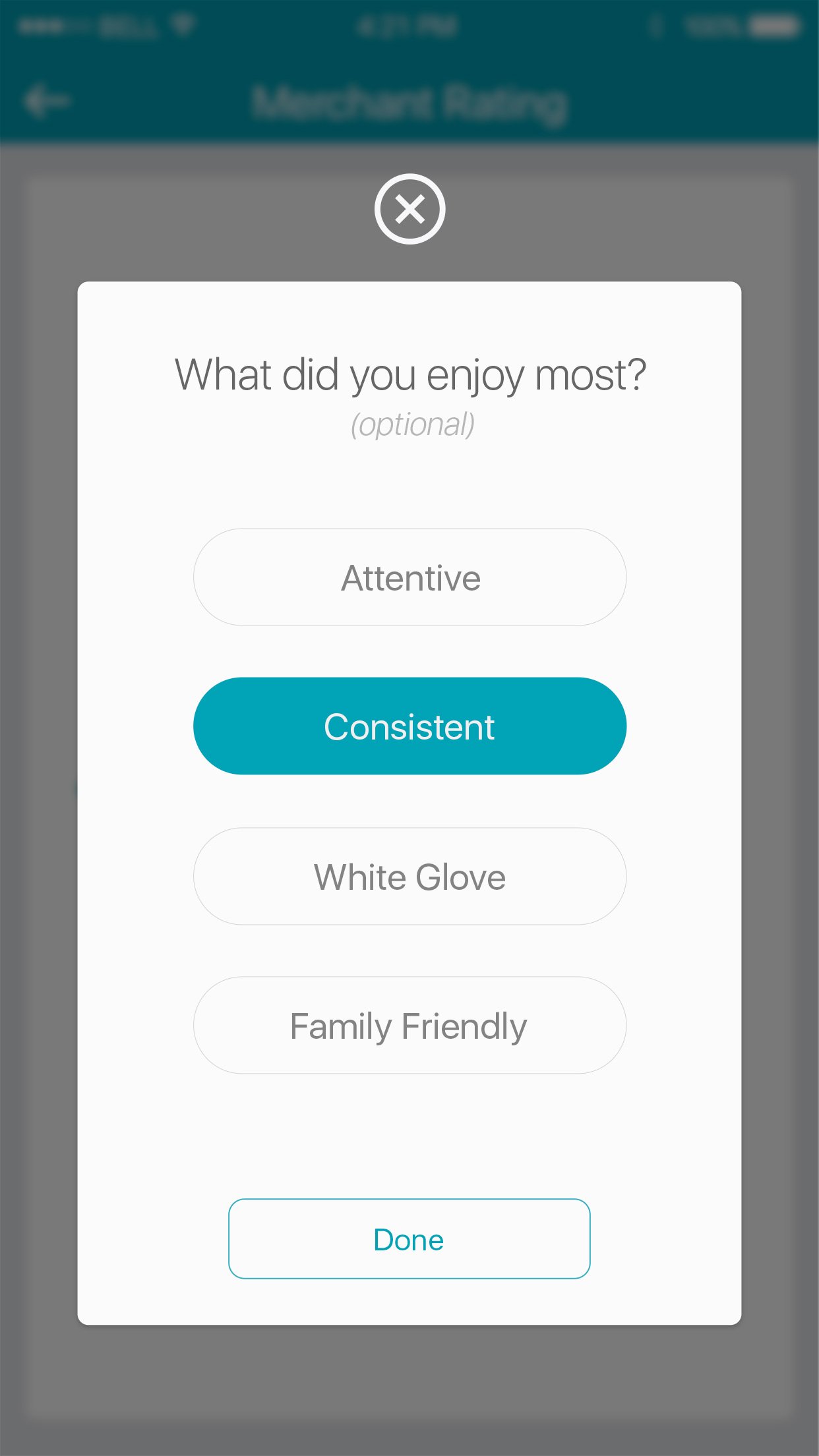
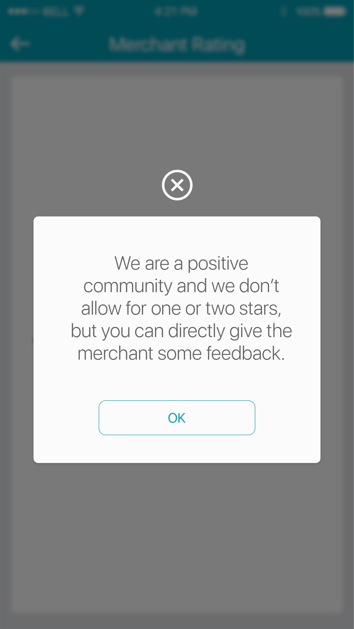
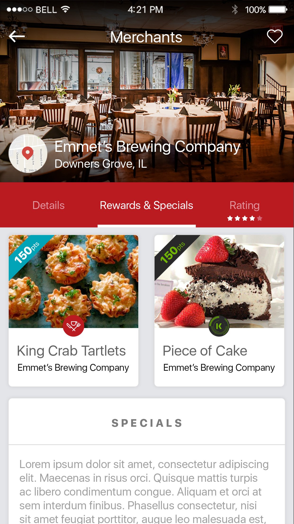
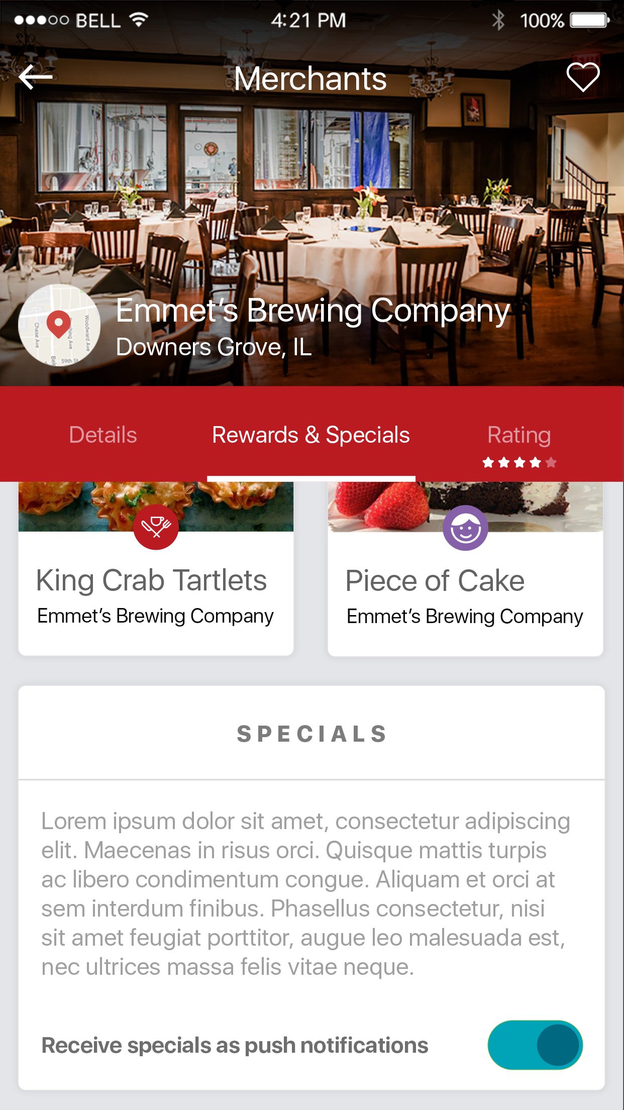
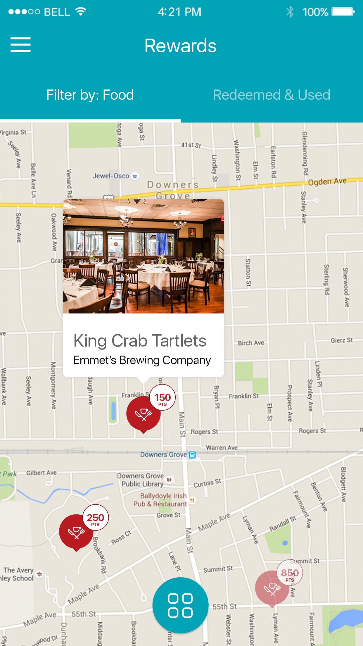
Two directories power the ecosystem: schools and merchants. Users can search, browse, and select which schools receive their contributions. Merchant profiles show ratings, rewards offered, and proximity, making it easy to choose where to shop.
School profiles display fundraising progress, leaderboard rankings, and a direct line of contact, giving parents and supporters full transparency into how their contributions are being used.
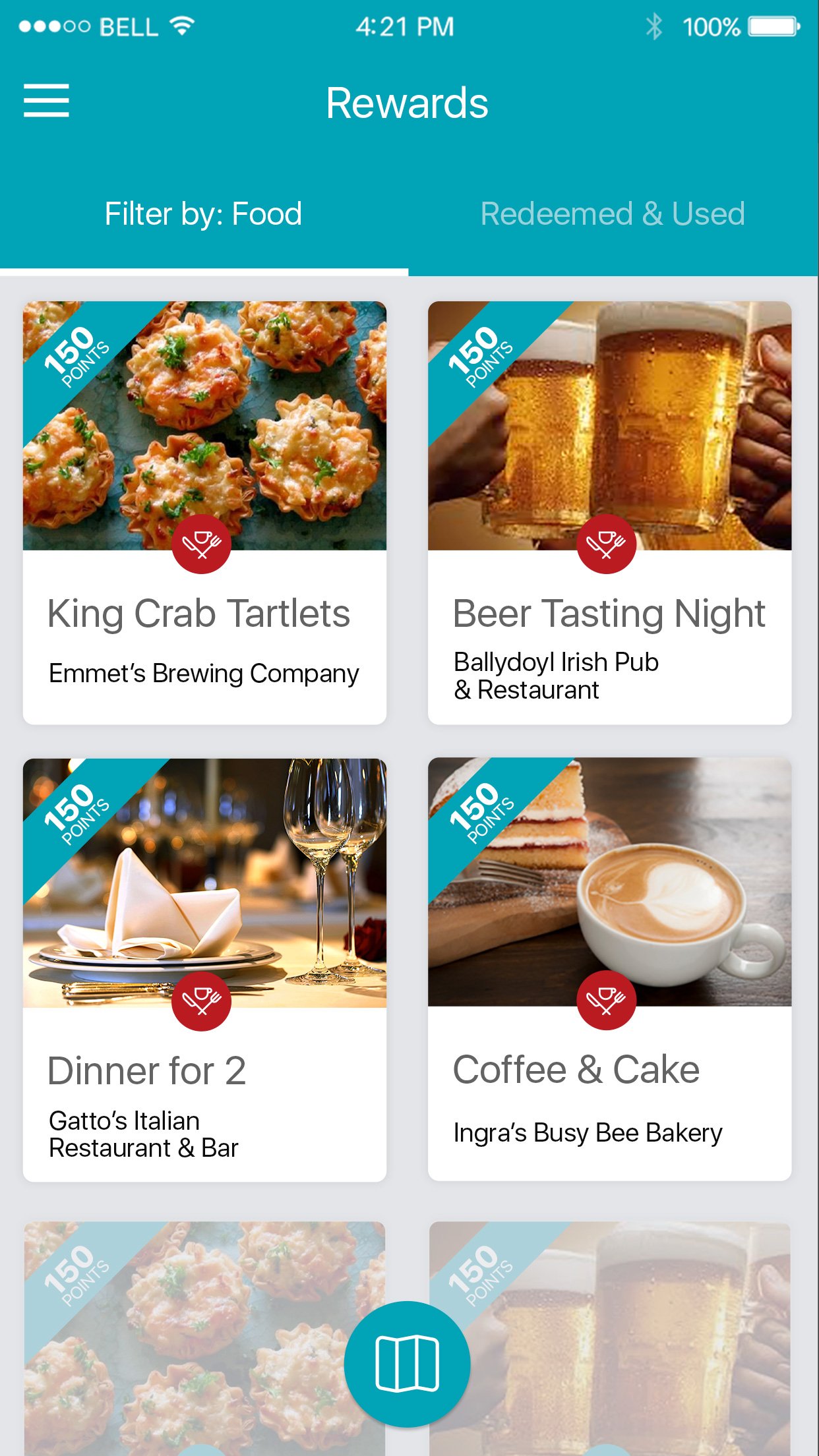
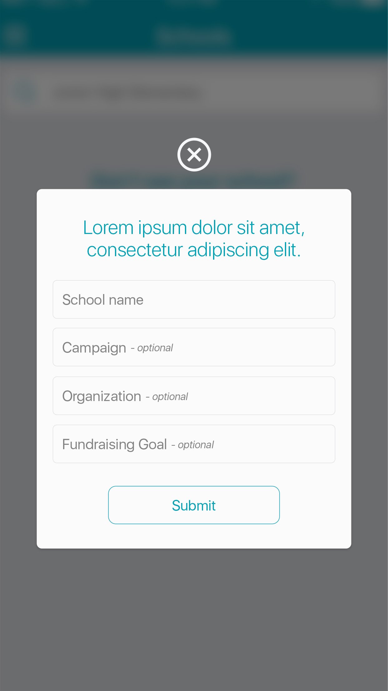
Making Loyalty Tangible
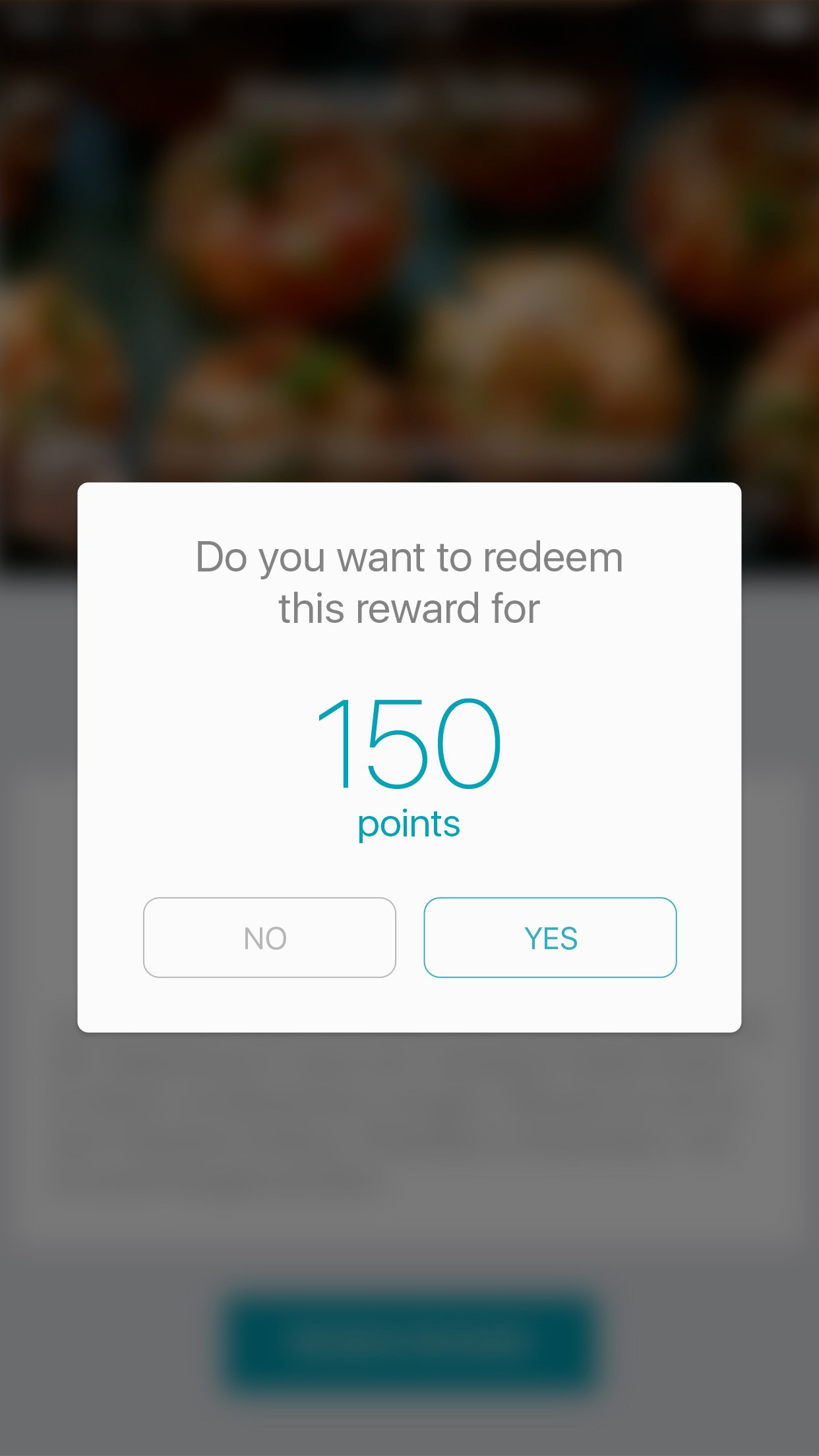
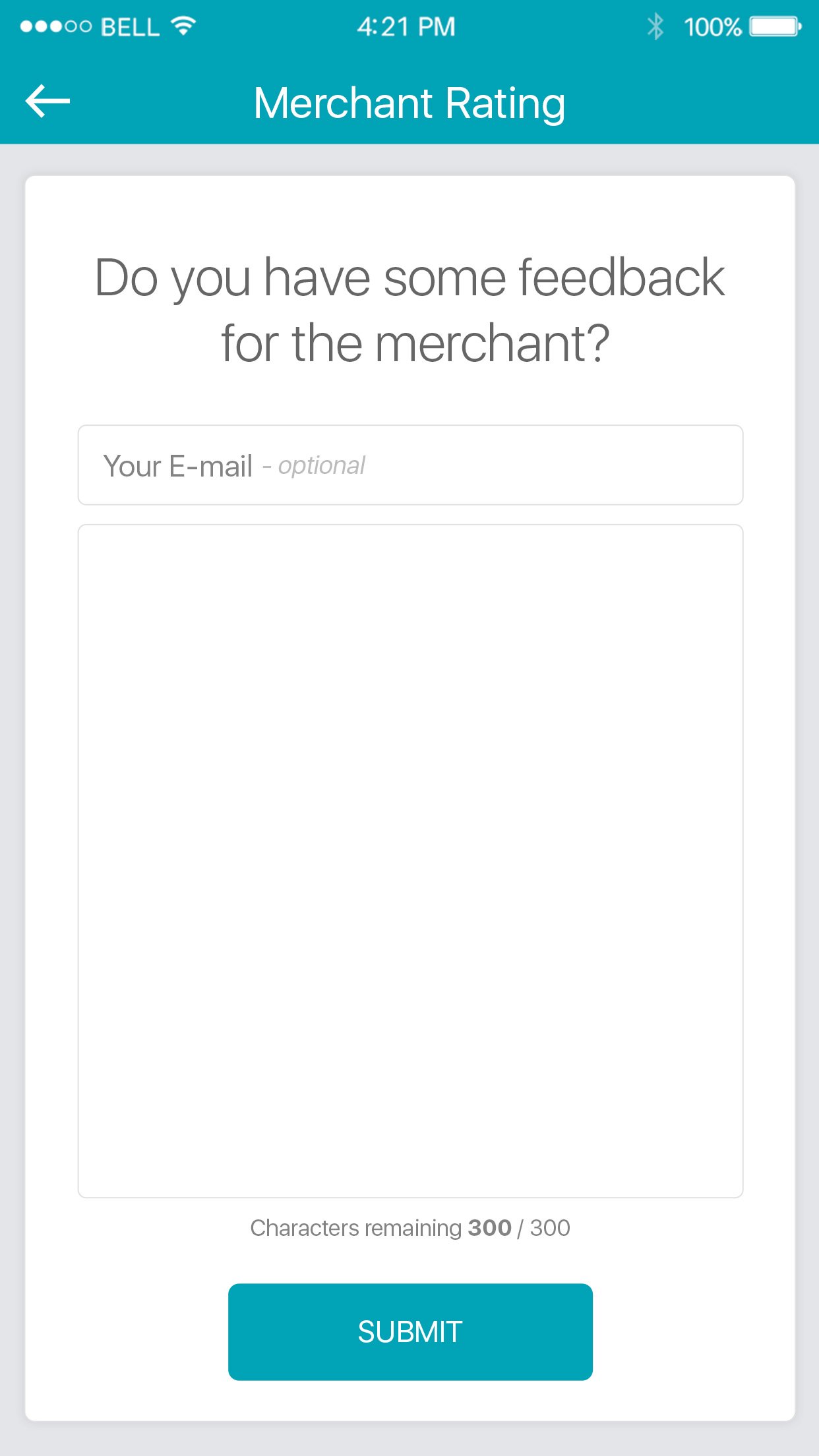
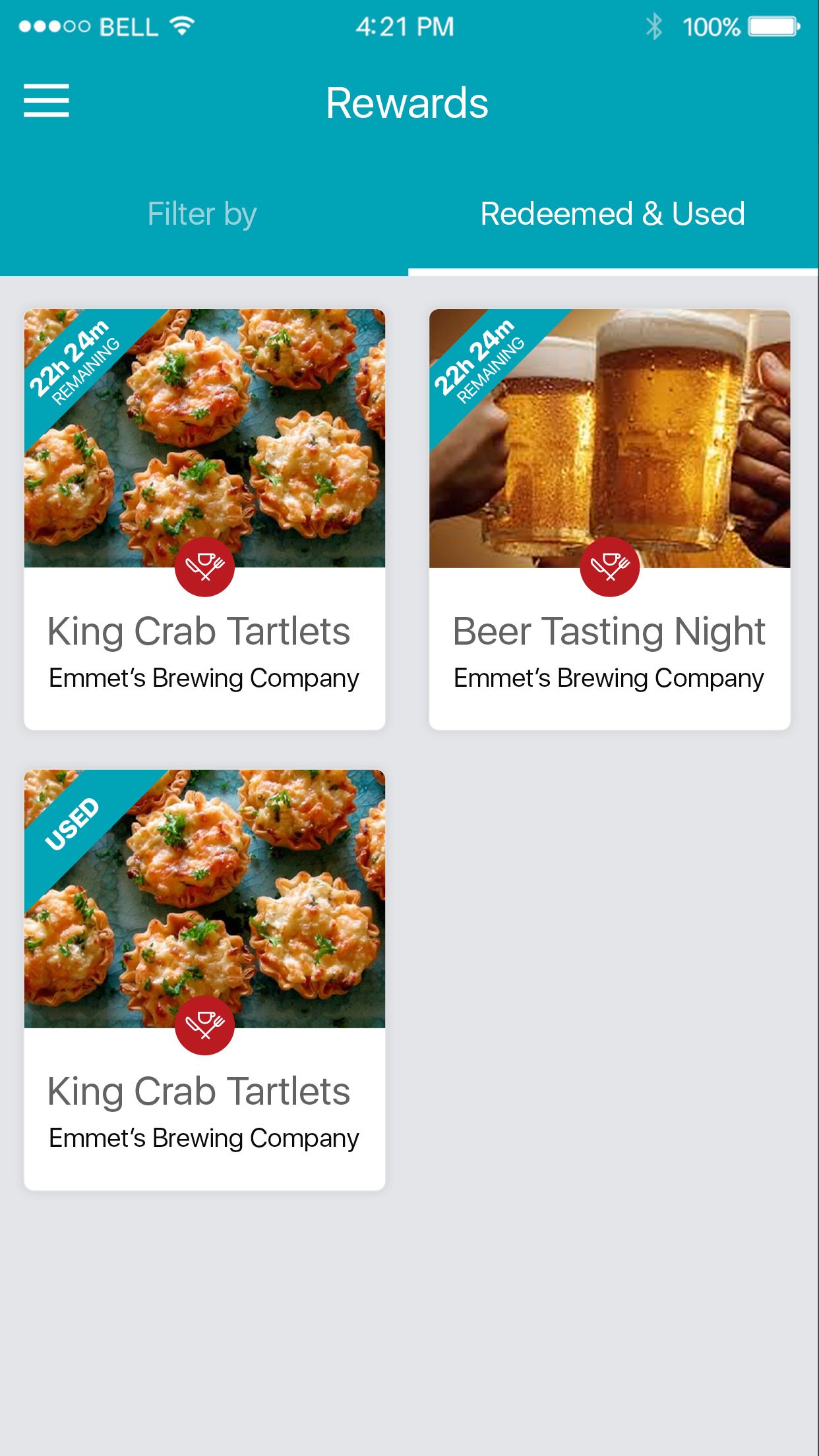
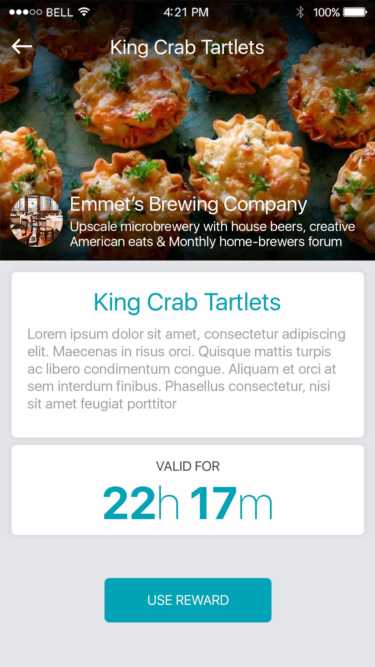
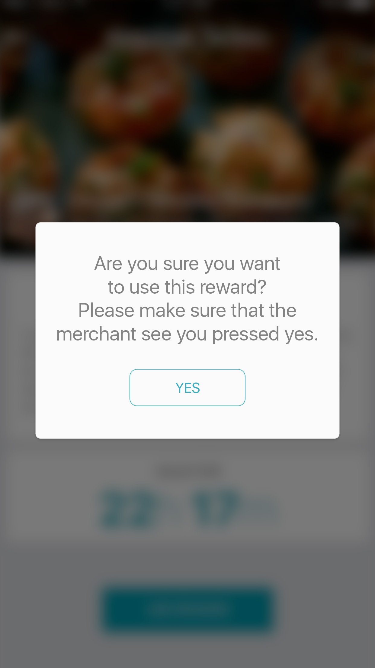
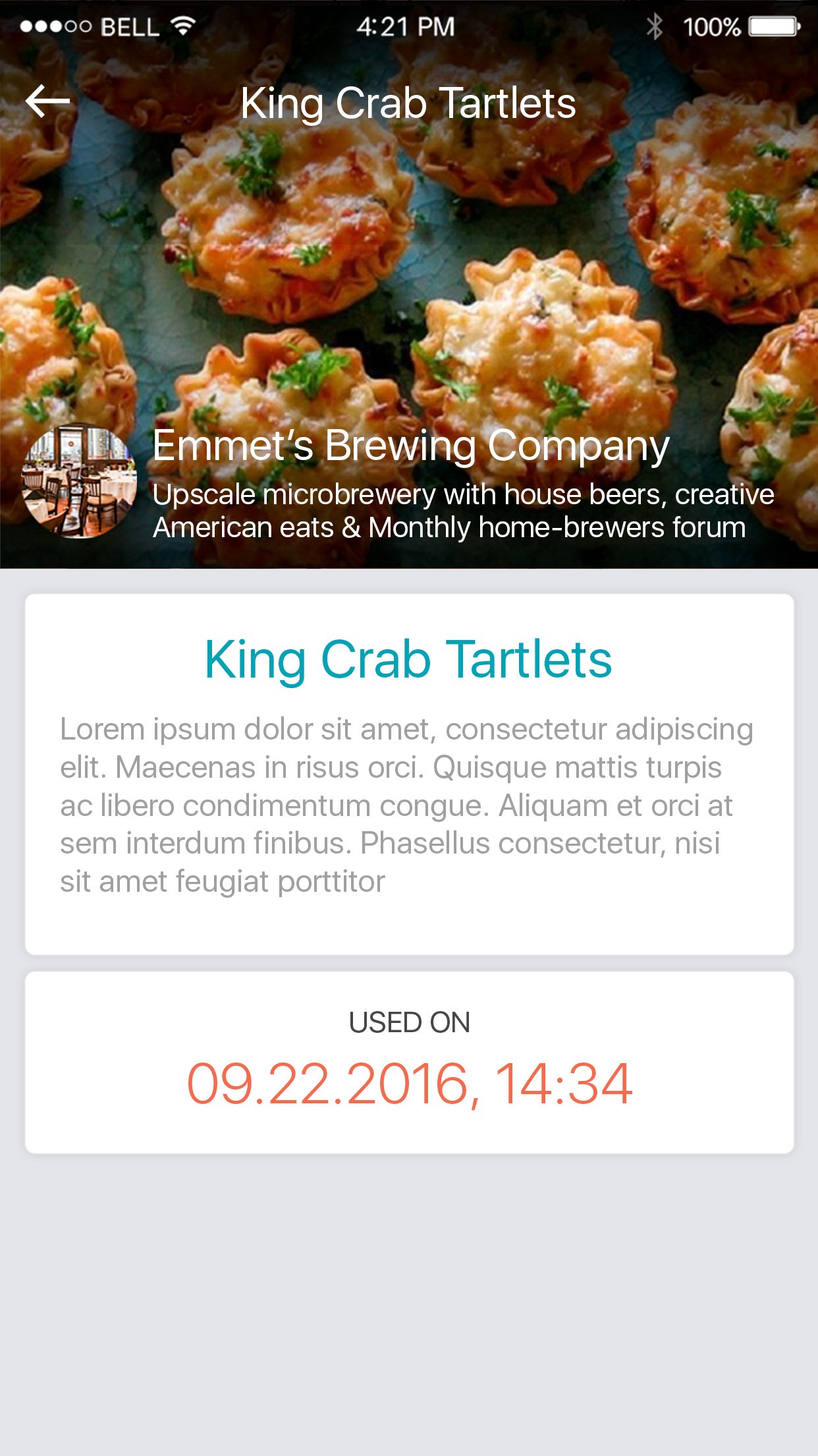
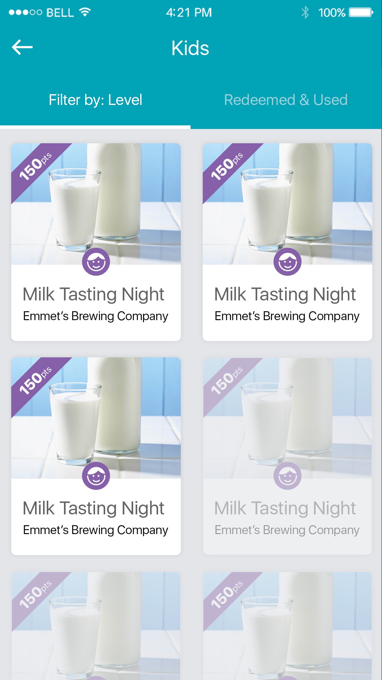
The rewards system is the gratification engine that keeps the flywheel spinning. Merchants offer exclusive rewards, from discounts to free items, redeemable through accumulated points. Users browse available rewards, view details, and redeem directly from their phone.
The reward redemption flow was designed to be satisfying: clear point costs, a single-tap redeem action, and a celebratory confirmation screen that reinforces the behavior loop.

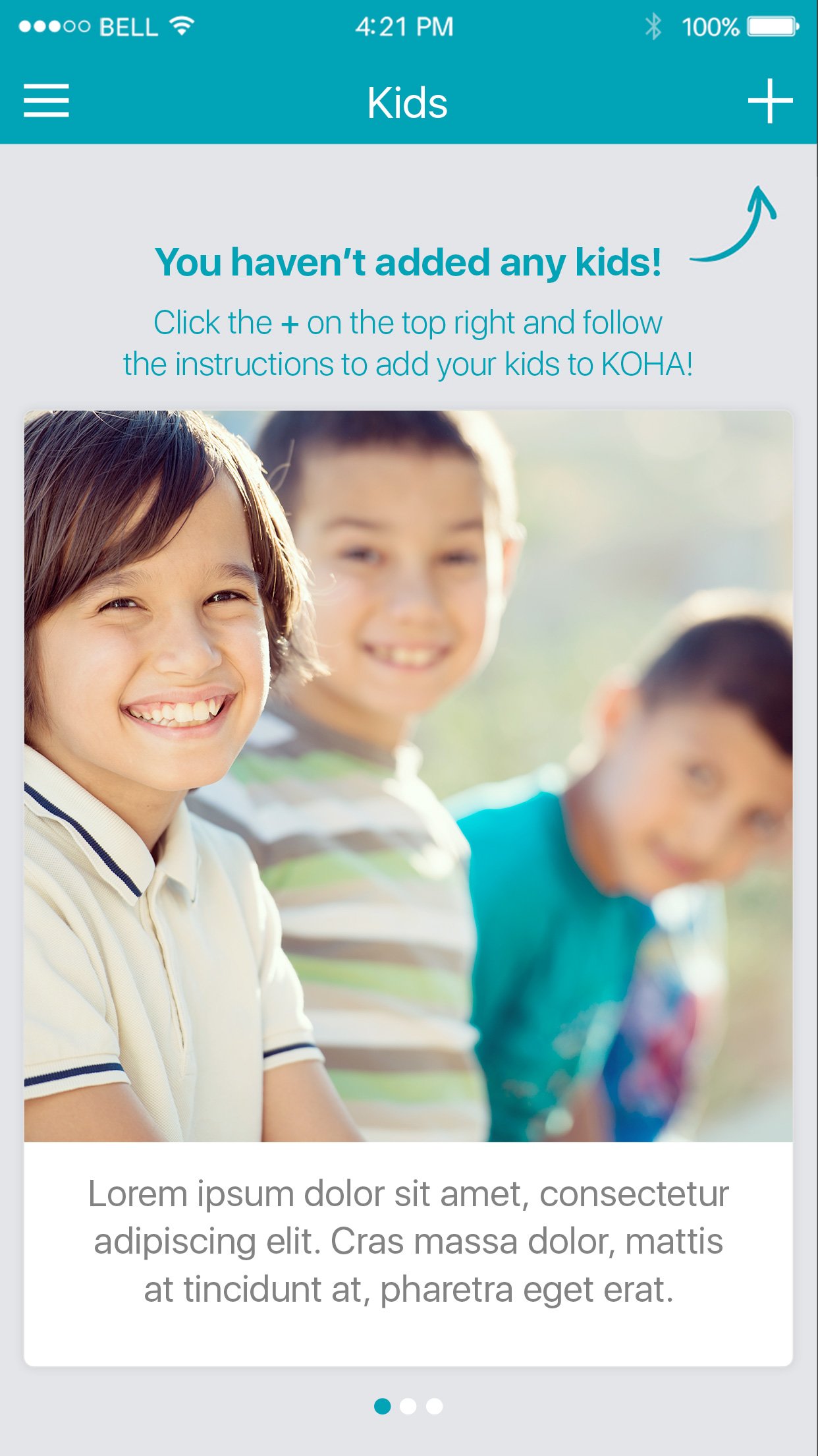
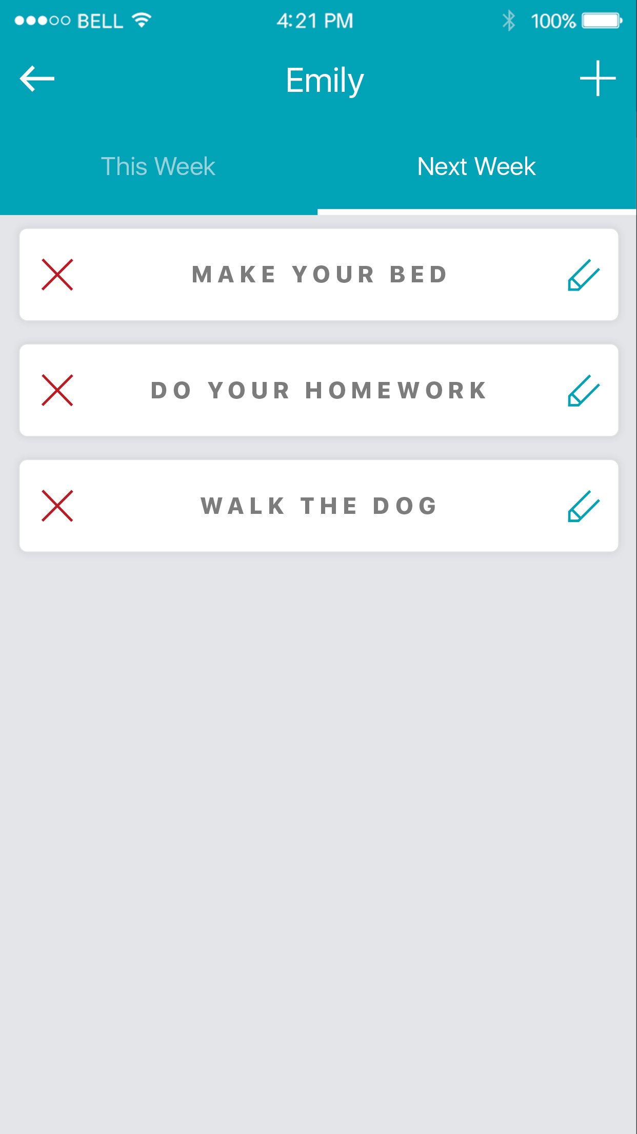
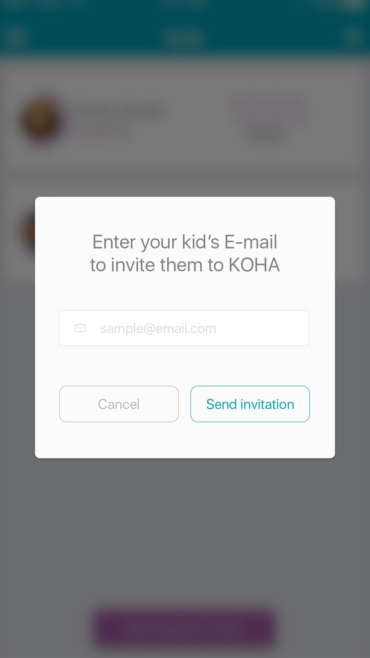
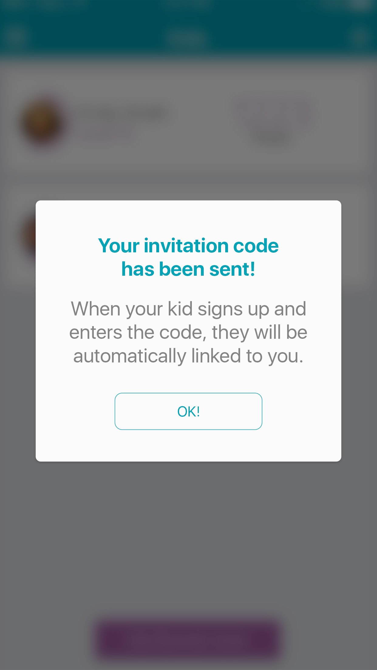
Building Habits Early
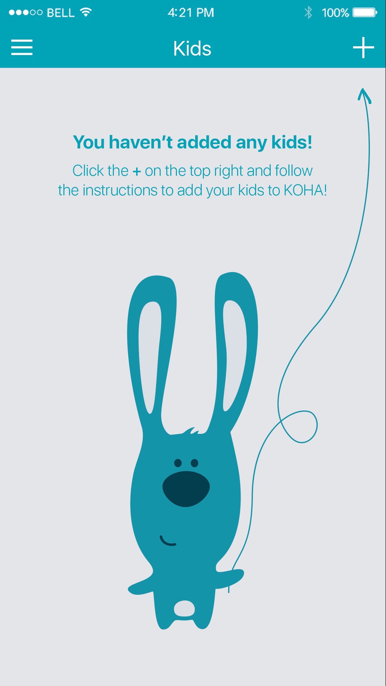
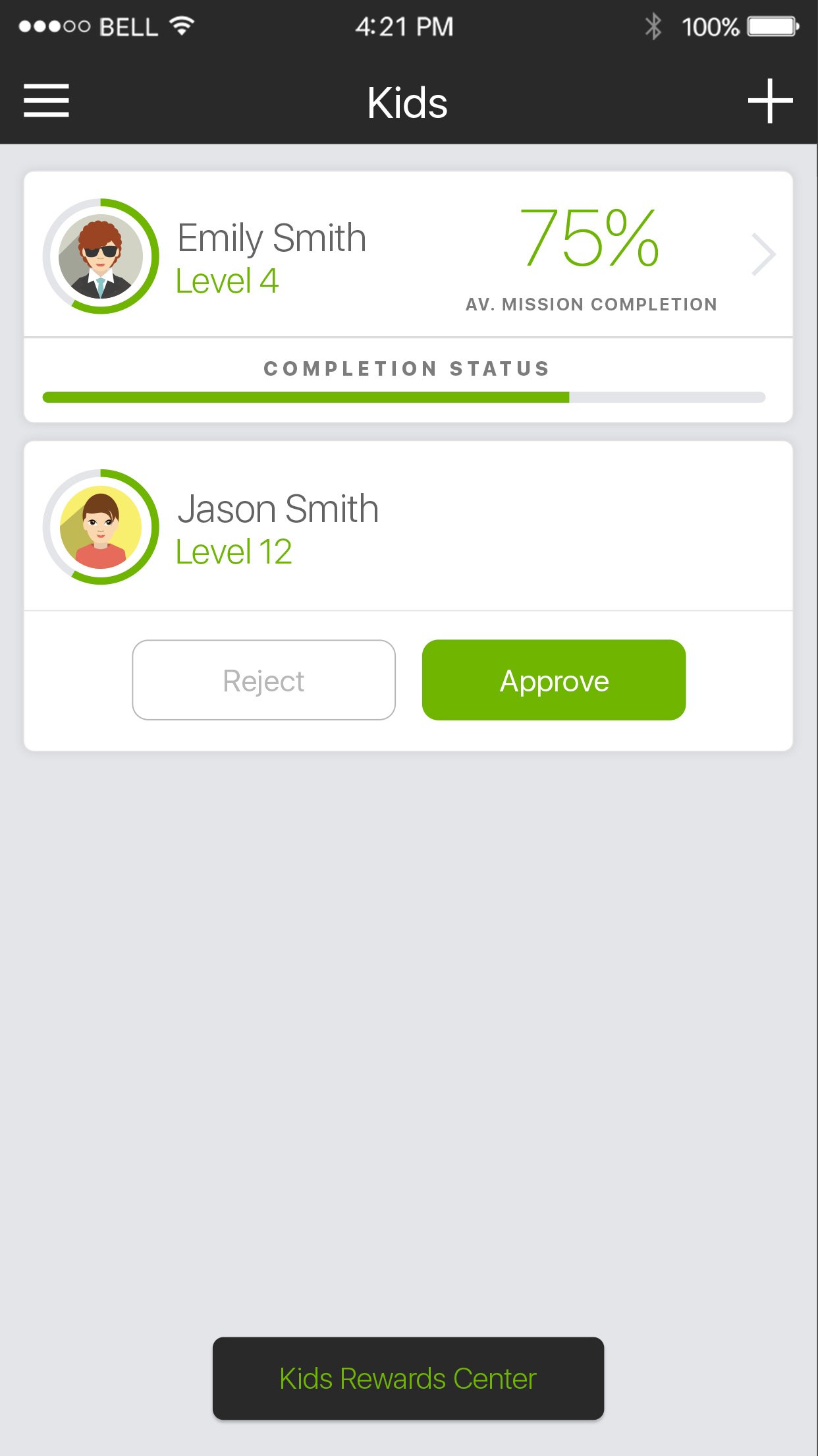
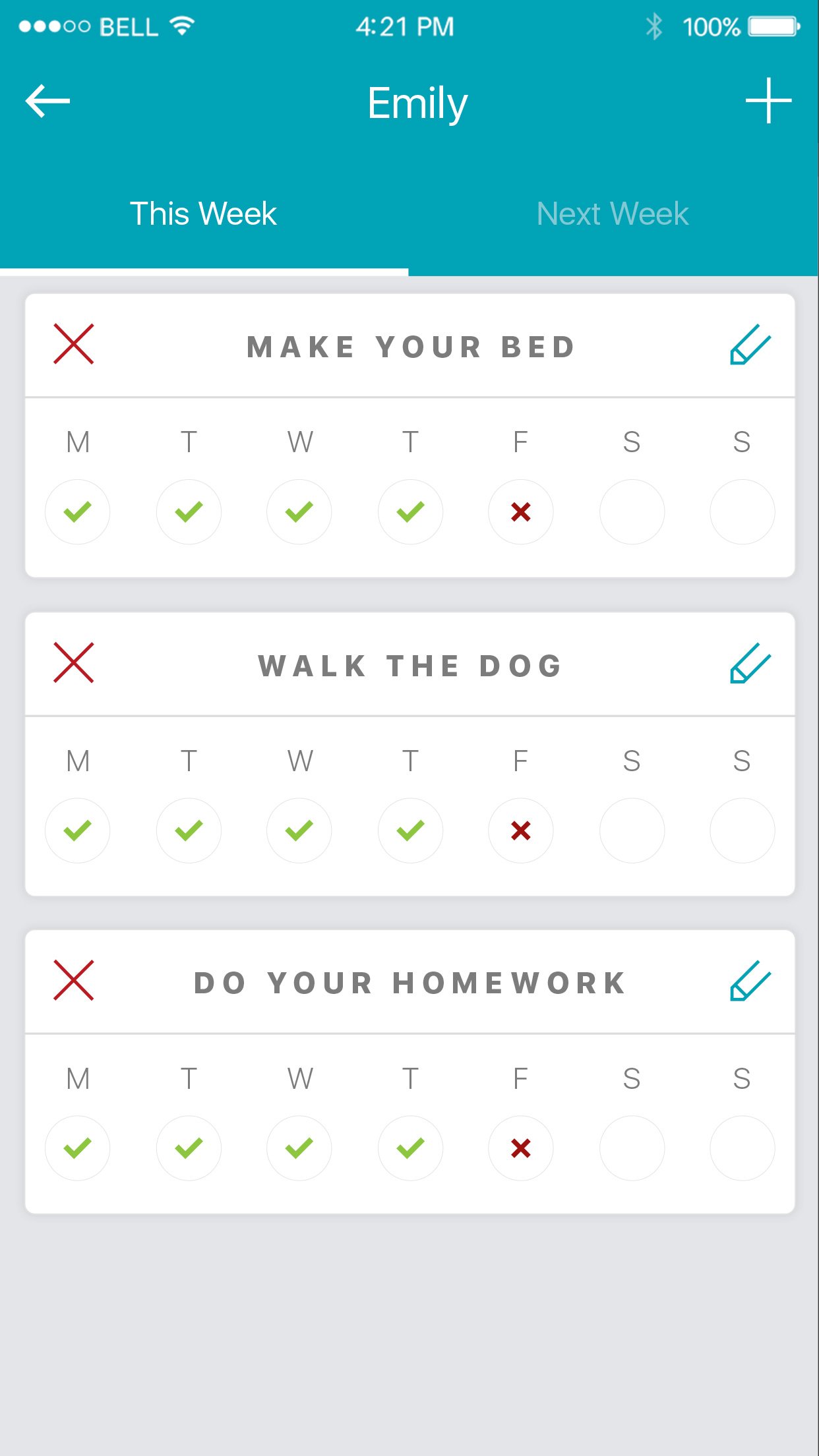
Koha extends beyond individual users with a dedicated Kids section. Parents can add their children to the platform, assigning them tasks and tracking their own mini contribution journey. The interface is playful; custom bunny illustrations and bright, friendly UI make the experience approachable for younger audiences.
This section was designed to plant the seed of community awareness early, turning everyday chores and shopping trips into lessons about giving back.
Design Language
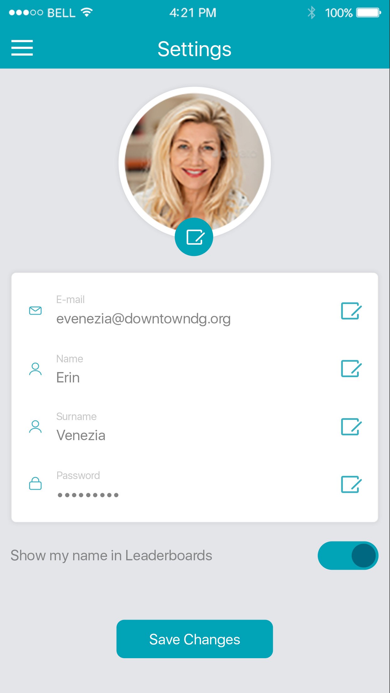
Every visual decision was made to reflect warmth, trust, and community. The design language balances playfulness with clarity, ensuring the app feels approachable without sacrificing professionalism.
Color Palette
Warm greens and vibrant oranges evoke growth and energy. Each color maps to a functional role, green for community, orange for rewards, blue for information.
Card-Based UI
A consistent card system creates visual rhythm across merchants, schools, and rewards. Rounded corners, subtle shadows, and generous padding ensure readability.
Custom Illustrations
Hand-crafted illustrations bring personality to empty states and the kids section. The bunny character became a mascot that users could connect with emotionally.
Full Screen Gallery
65+ screens designed across 6 core flows, every interaction considered, every pixel intentional.


Reflection
Koha was more than a design project; it was an exercise in translating a deeply human mission into a digital product. The biggest challenge wasn't any single screen or flow, but ensuring that the sense of community generosity was embedded in every interaction, from browsing merchants to watching a progress bar fill up.
The project reinforced a core belief: great product design isn't about making things look beautiful; it's about making people feel something. When a parent sees their grocery receipt contributing to their child's school art program, that's not just UX. That's meaning.