gov.gr
The digital home of the Greek State, where every public service lives in one place.
View live- UX & UI Designer, via Pixelocracy
- 2020
- 2019 to 2023
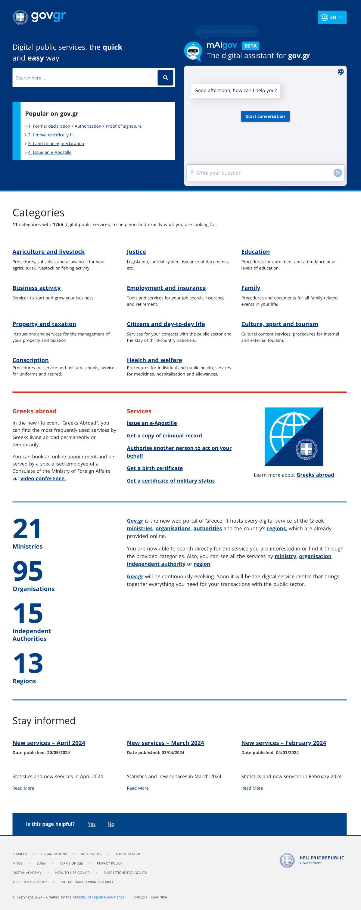
- 1765+
- 11
- 21
- 95
- 15
- 13
Serves every citizen and business in Greece, plus Greeks abroad, in Greek and English.
The problem
Greece's public services were scattered across countless sites and offices. gov.gr had to make all of them feel like one place.
The portal brings 1765+ services from 21 ministries and dozens of organisations under one roof. The hard part was never any single screen. It was findability and clarity at national scale: helping anyone, regardless of digital literacy, in Greek or English, locate the exact service they need and trust that they are in the right place.
Who it serves and the constraints
The audiences span citizens navigating day-to-day life, businesses, and Greeks abroad, across a huge range of ages and digital comfort. The constraints were just as broad: public-sector accessibility and inclusivity expectations, a fully bilingual experience in Greek and English, consistency across services owned by many different authorities, and the trust and clarity a government service demands.
When the audience is an entire country, clarity is not a nicety. It is the whole job.
Approach
A handful of decisions make the portal coherent at national scale. Each one is about findability and trust, not decoration.
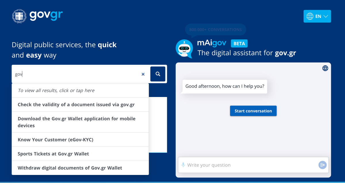
1. Search-first discovery
A prominent hero search with autocomplete, so people who already know what they want go straight to it.
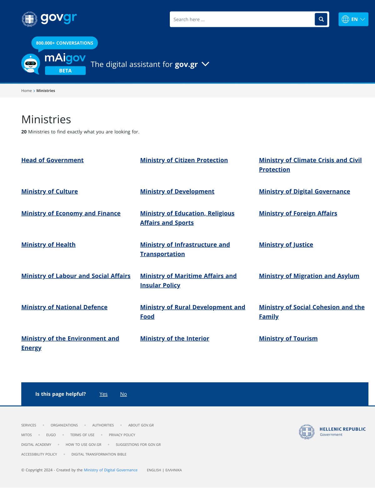
2. Many paths to one service
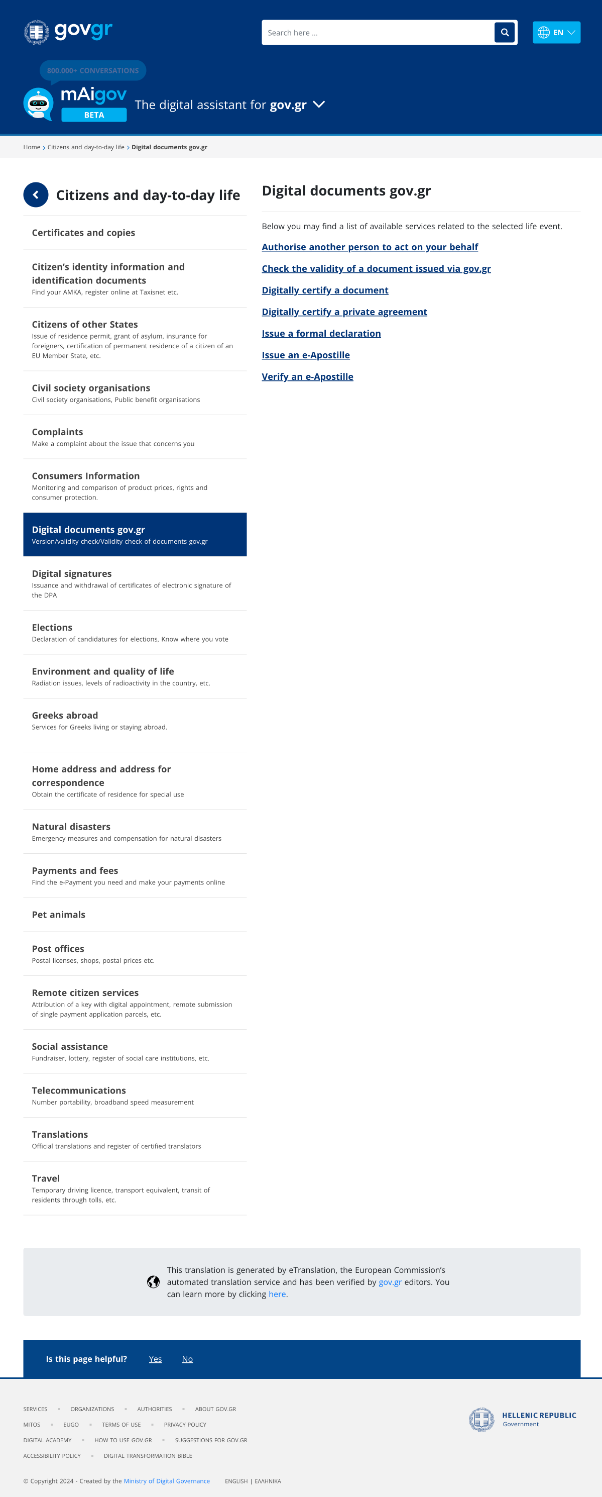
People think differently, so the portal offers several routes to the same place: 11 categories, life events such as "Citizens and day-to-day life" and "Greeks abroad", and browse by ministry, organisation, independent authority, or region.
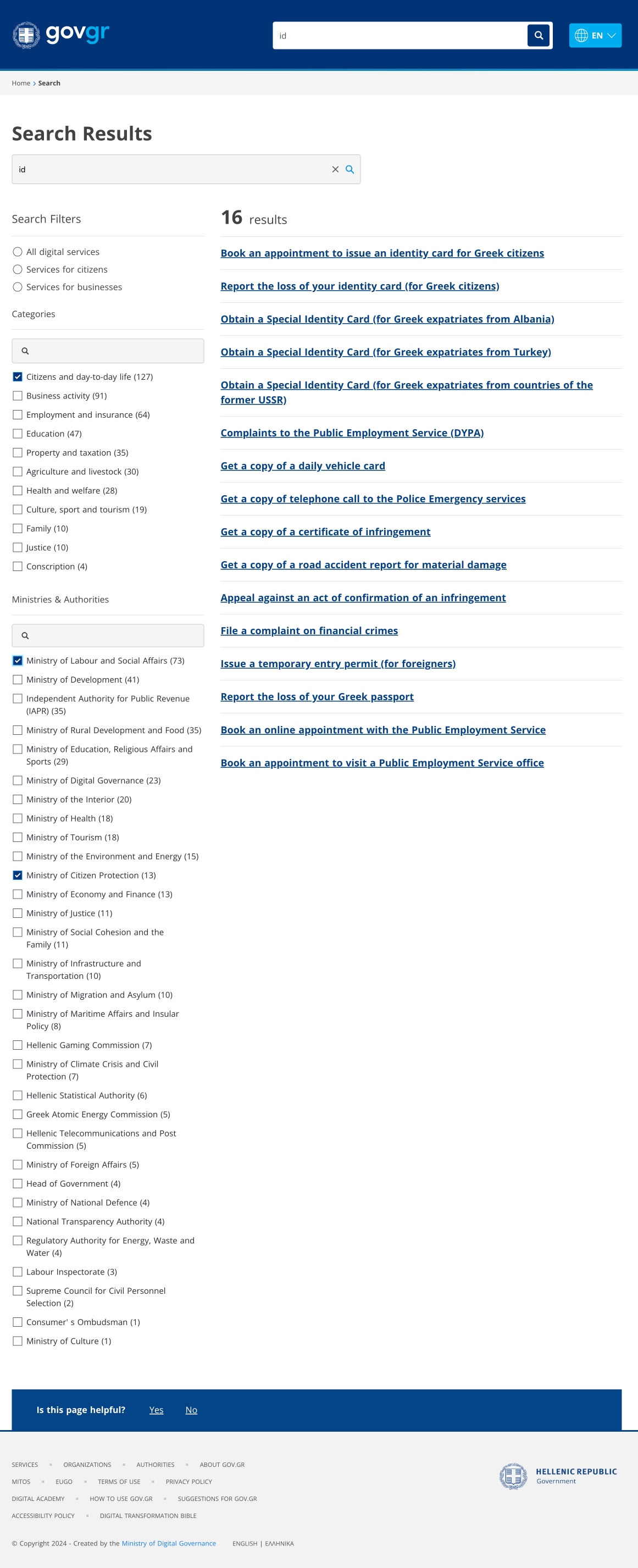
3. Faceted search results
Results filter by citizen versus business, by category, and by ministry, each with live counts, so a broad query narrows fast.
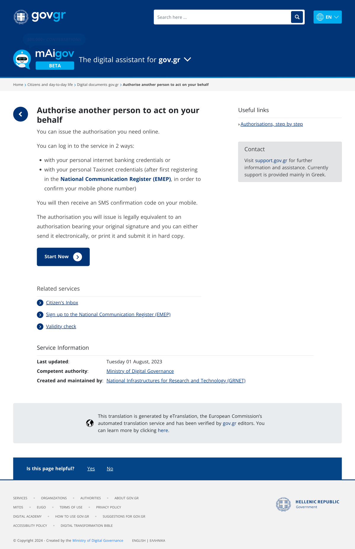
4. A unified service page, used by all 1765 services
Every service renders the same way: a plain-language description, how to log in, a single clear Start Now action, related services, service information and provenance, and an "Is this page helpful?" prompt. That consistency at scale is what makes the portal feel coherent rather than like dozens of separate sites.
5. Life-event and category navigation
A category opens into focused sub-navigation and a clean list of services, so a dense domain stays navigable.
6. Bilingual and accessible by default
Greek and English throughout, with accessibility treated as a baseline rather than an afterthought. On a national portal, that is what "for everyone" actually means.
Process
UX and UI design carried out at Pixelocracy, within the constraints of a national government program, in collaboration with the program team and the Ministry of Digital Governance.
- Information architecture: structuring 1765+ services into categories, life events, and search facets that match how citizens actually think.
- Iteration on the search experience, the navigation paths, and the unified service template.
- Design delivered in Figma, working closely with the engineering and content teams behind the portal.
Impact
- 1765+
- 11
gov.gr became the recognised digital front door of the Greek State, the single place citizens and businesses go to find a public service.
Reflection
Designing for an entire population is a lesson in restraint. The win is not a clever screen, it is 1765 services that feel like one coherent place, legible to a teenager and a grandparent alike.