How I Build Design Systems
A repeatable, AI-augmented process for building and evolving design systems, proven across four industries.
This is how I build design systems today.
A systematic process from research to measurement, integrated with engineering and accelerated with AI, and tuned to the product's domain rather than a generic template. The work comes from four systems in four very different industries, and they are the evidence behind every step that follows.
Design systems I've worked on
A snapshot of the systems behind this process, each built for a very different industry and audience.
PouncePanter
Dark-first system for security operations.
Security practitioners and analysts. Late-night triage, dense log data, split-second decisions.
Dark by default, high density, severity and semantics carried in color as a primary signal. Minimal-click flows to resolve alerts and issues fast. One system serving two audiences at once: people fluent in code, SQL, and Python, and people who are not. AI workflows woven into daily work without compromising classic, UX-perfect fundamentals.
IctinusOrfium
Light, fully tokenized system for the music industry.
In-house teams at record labels and rightsholders. They need to understand and act fast to accelerate revenue and resolve conflicts, often 10+ hours at the screen.
Information architecture and clarity as the core discipline. Tokenized end to end. Built for sustained legibility across very long working days.
LungoDialectica
Multi-theme, multi-device system for data-heavy products.
Internal designers across different domains, plus external users reaching the product through apps with a wide range of experience.
Themes that flex across B2B and B2C, desktop and mobile. Built for data and information-dense surfaces. Component flexibility as the organizing principle, so one system stretches across domains and audiences.
ProxyDigestProxyFoods
Dual-mode system for AI-powered product development.
F&B professionals moving off spreadsheets and into an AI-augmented web app.
Light and dark modes. UX, clarity, and ease of use as the brief. Designed to make the jump from Excel to an AI-augmented workspace feel obvious.
Research and audit
Before any token, I learn what the product actually needs.
Research is figuring out who the product is for, what industry it lives in, and the constraints that make all the difference. Everything downstream, every token, every component, answers to that. Four systems made that concrete, each built for a very different audience.
When a system already exists, I start by finding what is broken and what is worth keeping.
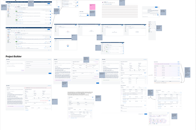
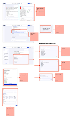
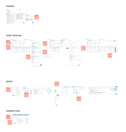
Assess token architecture, component coverage, accessibility, theming, adoption, and tech debt. Separate good bones from accumulated workarounds, then decide between repair and rebuild.
Pounce
A contractor revamp had introduced a transparency, alpha-based color scale that failed across light and dark, because a token's effective contrast depended on the surface behind it, on top of years of engineer-workaround tech debt.
The audit defined a full rebuild: a surface-independent color scale that holds in both themes, clearing the inherited workarounds.
Lungo
An existing system, Smoothie, that had to be assessed for whether it was worth keeping.
The audit led to the call to rebuild from the ground up rather than patch it.
ProxyFoods
A base shadcn setup as the starting point, with no clear line between what to keep and what to replace.
The audit drew that line: keep what works, replace the rest with custom, themed components.
Design, prototype, test
Then I design the architecture, prototype it, and pressure-test it against real use.
Token architecture first, components second. I prototype in Figma and increasingly with AI, then test with real content and against hard accessibility thresholds, in both themes. What follows is how the foundations actually look once they ship.
Primitive, semantic, group
My preferred structure, and how Lungo is built. Three tiers, each one references the tier above. Primitives hold raw values, semantics add meaning and theme awareness, group tokens scope to a component family. Change one alias and the whole system follows.
Primitive
Raw values, no meaning, no context. The single source every theme shares.
primitive.color.blue.100 = #85A0F1Semantic
Why and where a value is used. Theme aware. References primitives.
semantic.color.fill.action.neutralGroupcomponent
Component-family tokens for triggers, inputs, datagrid, and the rest. References semantics.
group.trigger.color.fill.action.primarytrigger.color.fill.action.primary.defaultfill.action.boldcolor.blue.300resolvesRadius, width, and the primitive ramps
The unglamorous layer that keeps everything cohesive. A small radius scale, three border widths tied to interaction state, and the raw ramps that feed the semantic tier.
Border radius
radius/12pxradius/24pxradius/38pxradius/416pxradius/fullpillBorder width
width/11px, defaultwidth/22px, activewidth/34px, focusedBlue, primitive
brand · action sourceNeutral, primitive
surfaces · text · bordersFour systems, one architecture
Same three-tier model, four different dialects. Pick a system and watch the semantic tokens and the typeface re-theme by swapping tokens, not by inverting colors.
Color adaptation, the scheme suffix
Text and icon tokens carry a two-letter suffix. First letter is the light-theme appearance, second is the dark-theme appearance. d is a dark value, l is a light value.
// only text and icon carry a scheme. border, fill, and data do not.
Ag
Roboto
Tokens cascade. Components follow. Ship only what passes contrast.
Automation and tooling
I build the toolchain that carries the system from design into code, working hand in hand with engineers.
Custom plugins, a token pipeline, AI guardrails, and a tight design and engineering partnership, so the system is implemented correctly and fast.
For Lungo, custom Figma plugins export tokens in a Style Dictionary shape, keep version history and diffs so an LLM implements only what changed, and emit component specs as both YAML and Markdown. On top of that I authored AI skills and rules for Claude and Cursor that enforce the system’s components, constrain building to approved tokens, surface implementation gaps, and audit work against the system. It was built in close partnership with the engineer who owns implementation. For the Pounce remediation, AI tooling plus the front-end engineers iterated to find and replace old code and broken components across the product.
Figma to code, and back
The system flows in one direction and the feedback flows back. Figma stays the source, Claude Design gives designers an interactive playground, plugins export specs and tokens and audit the design against the system, git carries versioned diffs, Claude and Cursor skills keep implementation on-system, and engineers implement and feed changes back into the source.
The plugins, and what they emit
Two custom Figma plugins do the heavy lifting: one exports a component’s spec, the other exports the full token set in the DTCG format the build ingests. Each sits next to a sample of its output.
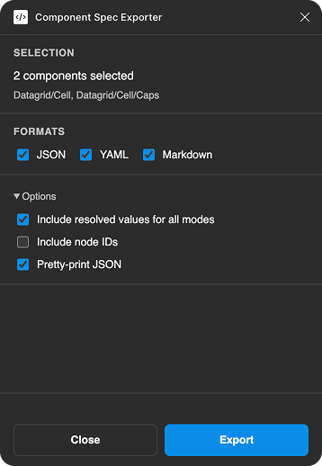
Sample, replace with a real export.
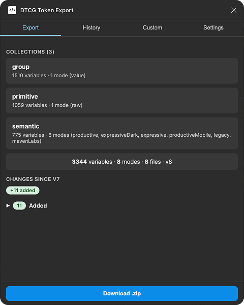
Part of the v6 to v7 changelog. 586 added, 99 removed, 928 modified, 221 renamed.
Skills that keep AI on the system
I authored Claude and Cursor skills so implementation stays on-system by default. They share one rule set: approved components only, approved tokens only, gaps flagged, work audited before it ships.
Component implementation
Build and develop components straight from the design system guidelines, with its structure, tokens, and rules built in.
Page creation
Assemble pages using only approved design system components and tokens, nothing hand-rolled.
Lint and audit
Check an implemented design for design system coverage and flag anything off-system.
Documentation
I document for the people who use the product, not for a generic audience.
Structured component docs: anatomy, when to use and when not to, properties, and interactive examples, in Storybook with lint rules. The part that matters most is usage guidance and copy written in the product’s own domain language, not boilerplate.
Pounce documentation speaks the language of security operations. Ictinus speaks to rights and entertainment. A food-science system speaks to formulation and R&D. The examples and the copy reflect real product scenarios, which is why teams actually read and follow them.
Generic documentation gets ignored. Documentation in the product’s own language gets used.
The board set
A fixed skeleton, so a team learns the structure once. Same eight boards on every component, with the examples and copy written in that product’s language. Boards shown below with real snippets from Tag and Side panel.
Overview
What it is, when to use, when not, and the nearest pattern to avoid.
Anatomy
The named parts on a numbered diagram, plus the rules that keep it tidy.
Types
The families and variants the component splits into.
States & behaviour
How it responds to input, and how it coexists with the page.
Usage & content
Grouping rules, label copy, and do and don't pairs.
Accessibility
Keyboard, focus, labelling, ARIA, contrast, and target size.
API & props
The contract, as property, values, and default tables, one per sub-component.
Use cases
Real product scenarios in the product’s own language. Called "In context" for layout components.
Boards for the axes a component actually has
On top of the fixed set, a component earns extra boards for the dimensions that are specific to it. Same skeleton, more flesh where it counts.
Seven shared intents, and the static-only emphasis ladder.
Four static sizes, three interactive, and how to choose.
Icon, indicator, or avatar before the label, plus the counter.
Each sub-part documented as its own board, with its own props.
Browse the documentation
The boards live in Storybook. Pick a component, then step through its set. Each board screenshot drops into the viewer.
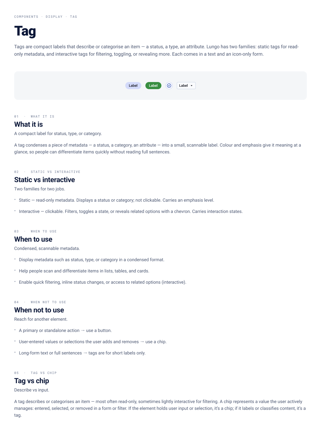
// each board maps to a Storybook screenshot · pick a component, then step through its set
KPIs and data
Finally, I measure whether the system is actually working.
Track delivery velocity, adoption and token and component compliance, accessibility pass rate across themes, contribution activity, and error rates, then use the data to prioritise what to build next.
- 50%+
- 30%
Adoption
Share of UI built with the system.
Compliance
Share of values that are approved tokens, not raw hex.
Coverage
Components and patterns the system actually provides.
Accessibility
Contrast pass rate across both themes.
Contribution
Activity and number of contributors.
Outcomes
Delivery velocity, rollovers, and error reduction.
A design system earns its keep in velocity, consistency, and accessibility, and all three are measurable.
In short
The process is repeatable, and it adapts to each domain.
The result is the same every time: systems that ship faster, stay consistent, and are accessible by default.